
TL;DR:
Epom Ad Server now has a rebuilt interface, running alongside the original one. It answers questions the older screens made you chase. When a banner is not serving, the limit card names the cap that stopped it and links you to it. The dashboard reports one date range instead of three, so two revenue figures on the same screen finally agree. A data-rich dashboard that took 43 seconds to load now takes under a second. You can save a conversion funnel instead of rebuilding it every time, manage demand partners without an admin login, and work from a phone. The interface you use today keeps running, unchanged, until you decide to move.
Three things an ad ops person does most days: work out why a banner stopped serving, pull a report, and check whether yesterday was good.
On the older screens, each of those takes longer than it could. A banner sits dark under every limit you can see, because the limit that stopped it is on the campaign above. The dashboard shows you three different date ranges at once without labelling them, so two revenue figures on the same screen disagree and nothing explains why. On a large ad network, the statistics tree can take three quarters of a minute — when it finishes at all.
The rebuilt interface fixes all three.
If you are already an Epom customer, both versions are available to you right now — the new one sits at /v2/, the original stays exactly where it is, and both read the same data. Nothing was switched over for you. This article covers what you gain by moving, and the few places where the original screens still do a job the new ones do not.
If you are looking at Epom for the first time, this is simply what the platform looks like now.
To experience the fast and user-friendly ad serving firsthand, start a free 14-day trial of Epom ad server — no commitment until you decide.
What You Get Only in the New Interface
Using Epom for many years, you could get used to the older version. However, the new Epom UI brings more than just a sleek look. See it by these examples:
| What you can do now | On the older screens |
|---|---|
| Save a conversion funnel and reuse it by name | Rebuild the step order in every report |
| Set one date range for the whole dashboard, and compare it against the previous period | Three separate windows you cannot change together |
| Pick your date range from a calendar in the report form | A dropdown and two date boxes |
| Generate one tracking snippet for a whole funnel | Not available |
| Serve VAST 4.1, 4.2 and 4.3 video tags | VAST 3.0, VAST 4.0, VPAID and VMAP only |
| Let your demand team manage RTB partners without an admin login | Admin panel only |
| Edit email and notification templates in a proper editor | Plain text boxes |
Everything else described here works in both versions.
The new interface isn’t just to beautify our product, it’s built to do a job, fast. Our clients' teams spend all day in this interface. The improvements that matter to them are not the ones that are worth a big press release — it;s a report that loads in a second instead of forty, a screen that names the cap that stopped a banner instead of making you hunt through three levels for it. That is what people notice in week one when the real work begins.

A Quick Tour of the Main Screens
The point of rebuilding every page on one design system is that the pages stop differing from each other. Learn the shape once and it holds wherever you are.
Every record you open follows the same layout: a tree of your inventory on the left, the record itself in the middle broken into collapsible cards rather than one long scroll, and a Features panel on the right listing everything that can be switched on for that record. Search sits in the header on every page and takes Ctrl+K.
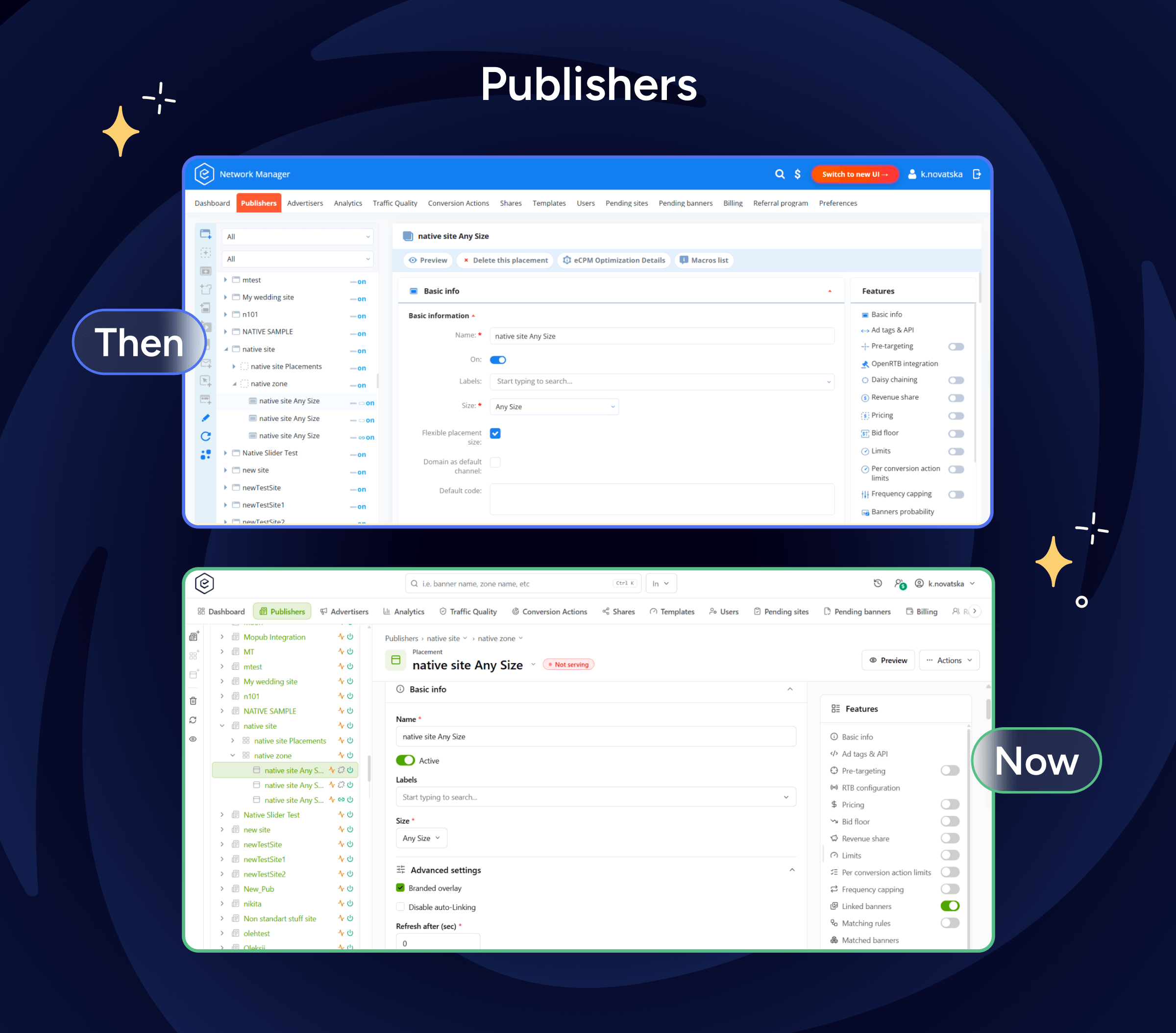
Publishers. Your supply side — sites, zones and placements, with the whole tree open on the left so you can move between them without going back to a list. Open an ad placement and everything it can do sits in one panel: pricing, limits, ad tags, linked banners.
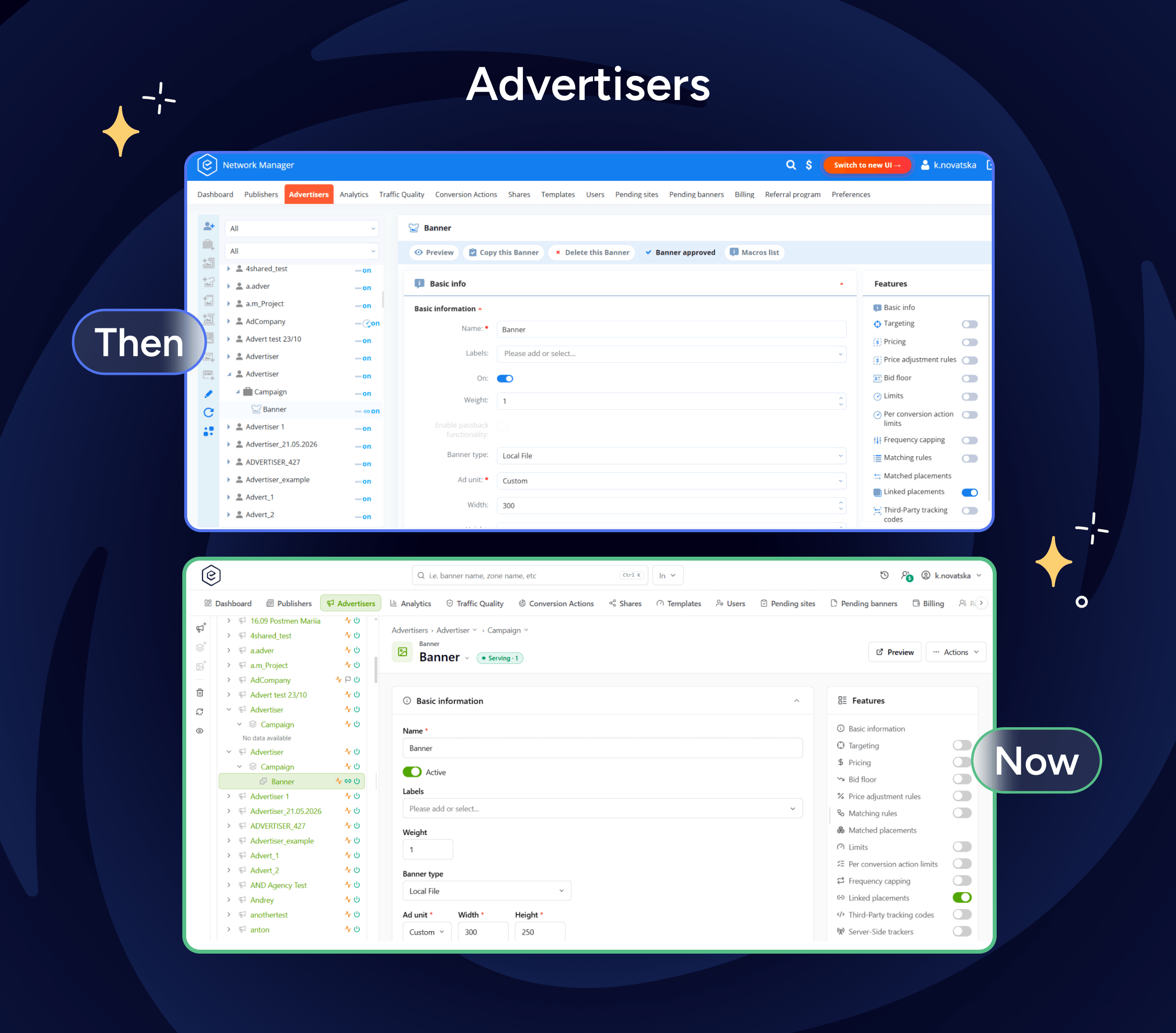
Advertisers. The demand side — advertisers, campaigns and banners, laid out the same way as Publishers. Moving between the two sides of the platform no longer means learning a second layout.
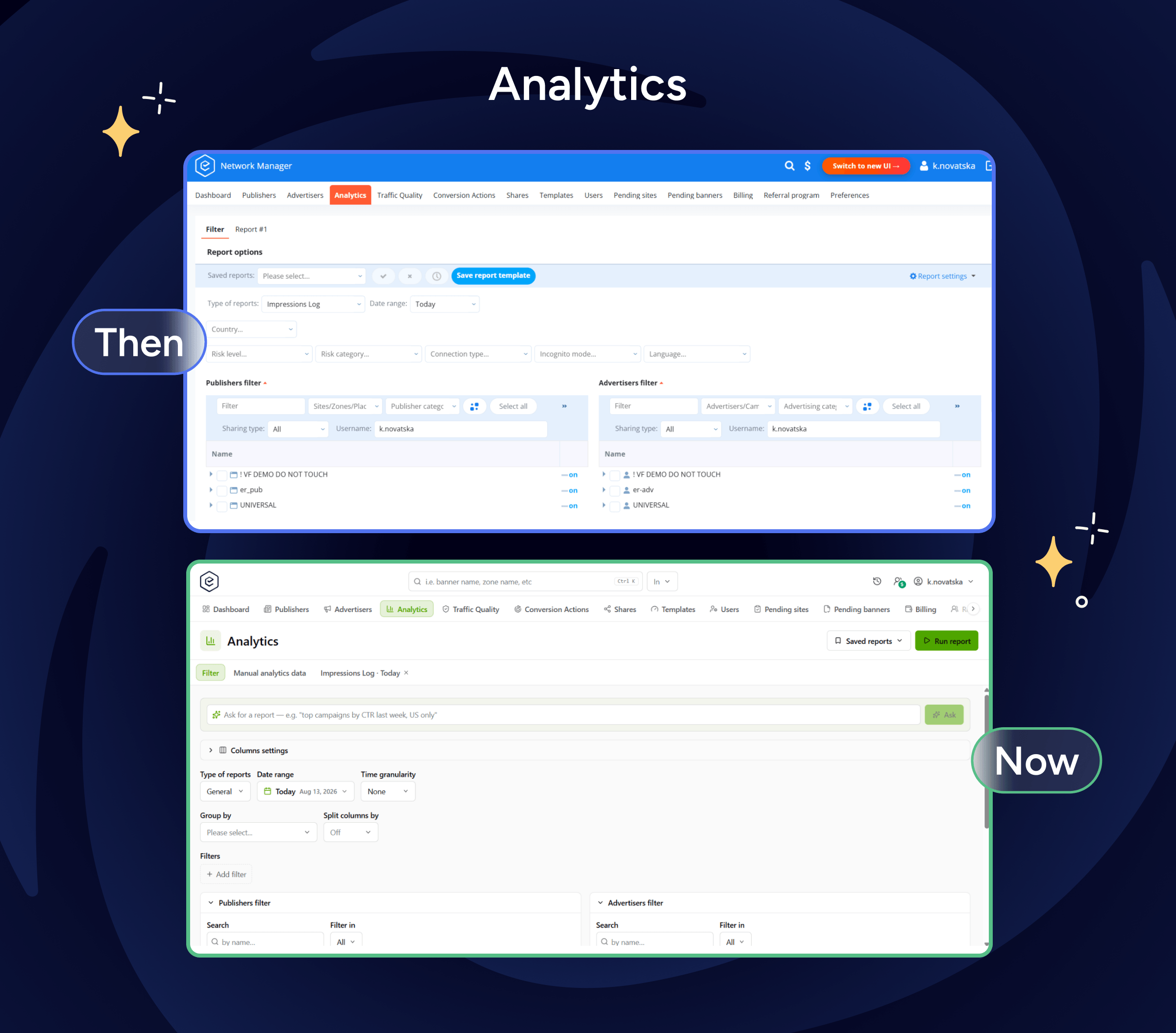
Analytics. Where you build reports. Choose a report type, set the date range, group and filter, or describe what you want in plain language and let the platform assemble the query for you. Reports you build often can be saved and re-run.
Billing. Balances, payments and invoices for the accounts you manage.
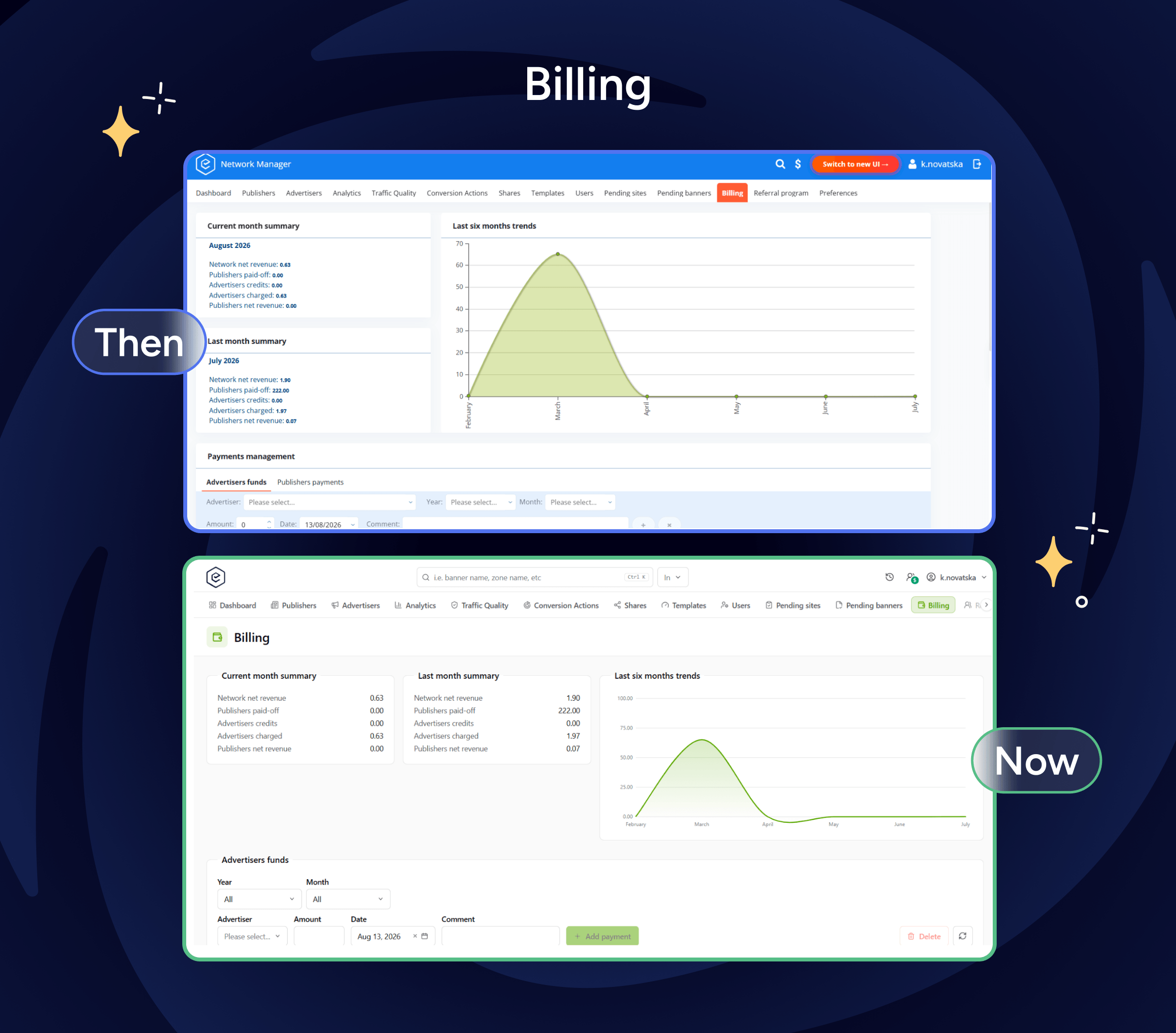
And now, let’s move to the concrete functionality improvements a new interface brings on the table.
One Date Range for the Whole Dashboard
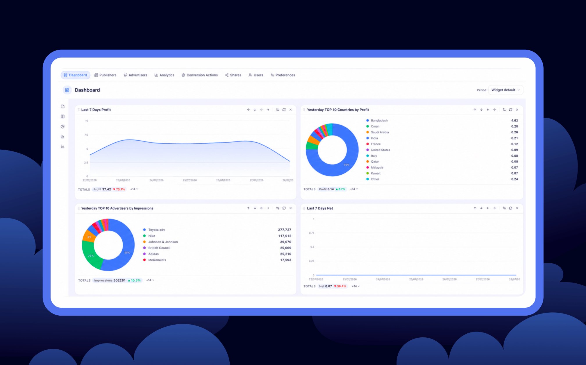
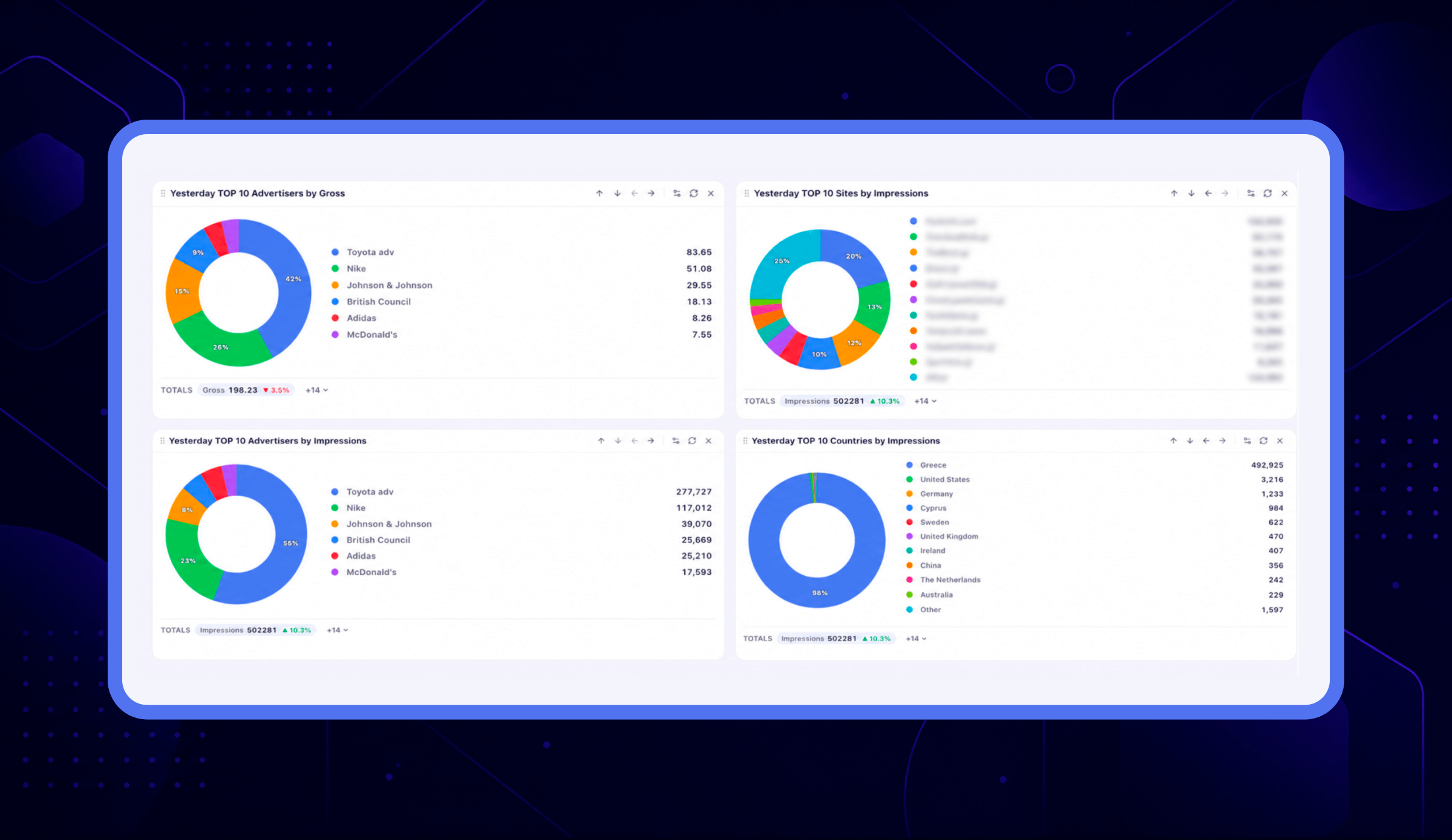
The publisher and advertiser dashboards used to report three different windows at the same time, and label none of them. The tiles showed yesterday, the trend chart showed the last 7 days, and the statistics tree showed today.
One control in the page header now sets the range for everything below it. Each card repeats that range as a small label, so a card read on its own still tells you which dates it covers.
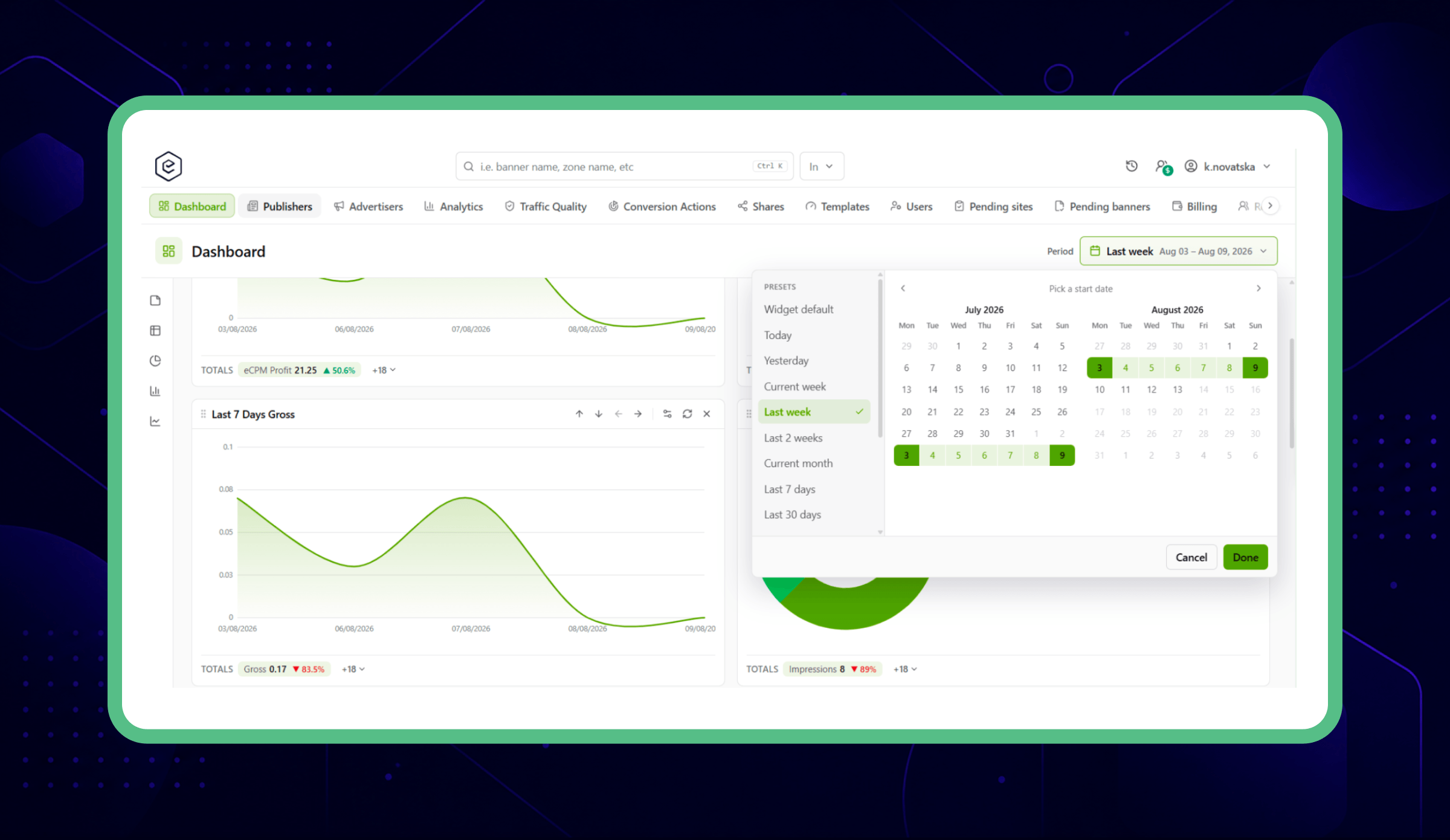
A few things it does that the old controls did not:
- Turn on comparison and the previous period of the same length is drawn behind the current one, with each tile's change captioned by the dates it is measured against.
- A single day is charted hour by hour instead of collapsing into one dot.
- On Today, a dashed line marks how far the day has run, so a half-finished curve does not look like traffic collapsing.
- The widget dashboard gets the same control, so all three boards offer the same fourteen ranges as the report builder.
Two related improvements reach the original dashboards as well, since both versions read the same data. The statistics tree is much faster on large networks — one 2,900-site network went from 43 seconds, usually never finishing, to under a second.
The Limits Card Names What Stopped Your Banner
A banner can sit dark while every limit on its own page looks fine, because the one that stopped it belongs to the campaign or the advertiser above it. On the supply side, a site that has spent its budget stops all its placements.
The limits card now opens with a line naming the nearest level that is spent, the limit it hit, and a link straight to it. That note appears whether the card is open or closed.
The card itself is now a grid: metrics across, time periods down. Requests, which only ever had a lifetime limit, gains the shorter periods, and sites and placements get their own Requests, Impressions, Clicks and Conversions limits.
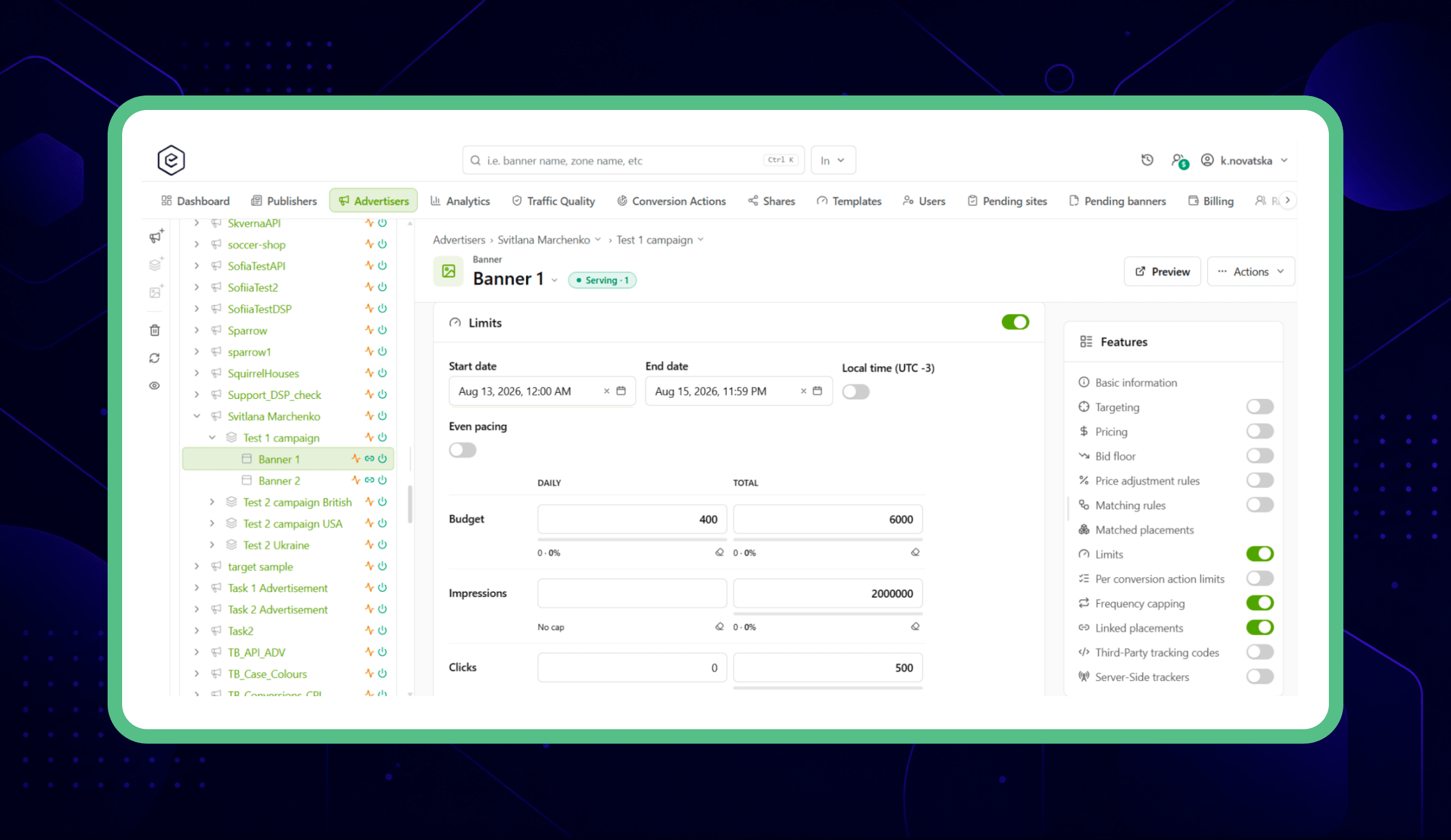
Each limit carries a progress bar and a percentage, so "how much of this period is left" is something you read rather than calculate. The form also checks that your limits make sense together — a shorter period cannot be set higher than a longer one — and tells you which pair is wrong instead of accepting one that can never take effect.
One long-standing gap closed with it: the monthly impressions limit had been a field on the form for years with nothing behind it. You could type a number in and watch delivery and ignore it. It works now.
⚠️ These limits are switched off until your network owner turns them on. Nineteen new permissions are disabled, so nothing new appears on your advertisers, campaigns, banners, sites or placements until someone grants them in Roles & Permissions.
Save a Funnel Once Instead of Rebuilding It
A funnel used to be a selection you recreated for every report: find the steps among every conversion action on the account, pick them in the right order because that order becomes the column order, and hope the next person could work out the sequence from the names.
You can now save it — a name and an ordered list of actions — and pick it by name in the analytics split control, where it is listed first.
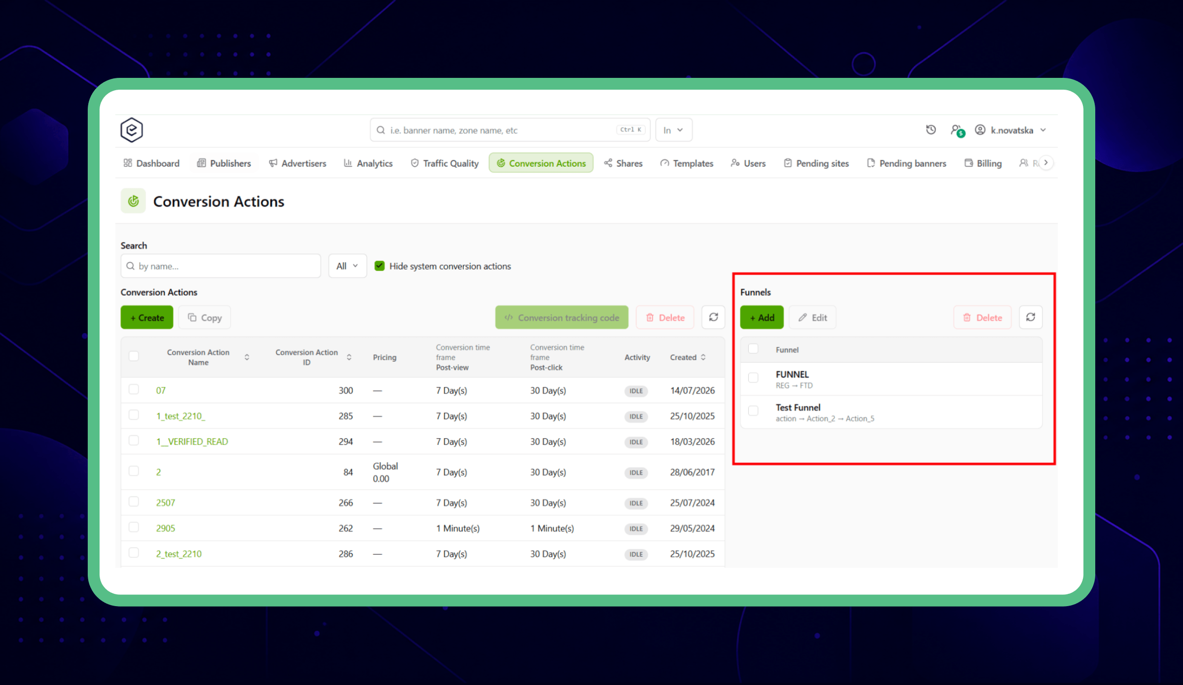
The campaign's Conversion actions card carries Actions | Funnels tabs, and the tracking code window opens against whichever you picked. Open it on a funnel and the generated snippet carries one tracking line per step, in the funnel's own order.
Your Demand Team Does Not Need an Admin Login
DSP Partners, DSP Partners Analytics and DSP Creative Scan used to live in the admin panel only, so whoever managed your demand partners needed a full admin account.
All three are now also an RTB tab in the account area, each behind its own permission. You can give someone DSP Partners Analytics on its own and they will watch performance without being able to change a partner setting.
All three arrive switched off, so no existing role gains anything when you upgrade, and the tab only appears once you grant at least one. The admin panel is unchanged — the same three pages are still where they always were.
It Works on a Phone
A campaign overspends on a Saturday. A publisher emails about a broken placement while you are travelling. The old interface handed you a desktop layout squeezed onto a phone screen.
The new one has a layout built for it: main sections along the bottom within thumb reach, windows that slide up instead of opening mouse-sized dialogs, input fields large enough that iOS stops zooming every time you tap one, and lists you can browse without pinching.
It is built for checking, approving and fixing. Building a campaign from scratch is still desk work.
Your Brand Instead of Ours
If you resell ad serving, your publishers and advertisers log into a platform that should look like yours. The new interface ships 20 colour themes and an editor for building your own light and dark version, applied through the interface's shared colour layer.
Smaller Things That Save Time Every Day
- Paused now looks paused. A paused banner with active linked placements used to show a green Serving · 4. There is a grey Paused state now, and pausing from anywhere updates the other side of the link.
- Long lists keep your picks in view. Past ten options, everything you have ticked gathers into a “Selected (N)” section at the top — and stays put while you keep ticking, so a row never jumps out from under your cursor.
- Email and notification templates get a real editor, with the macro list inserting at your cursor instead of at the very end of the document.
- Bulk creative upload takes MP4 video. Files upload as you pick them, a second pick adds to the batch instead of replacing it, and a name you type is kept.
- Dates appear in the language you chose in Preferences, not the browser's.
What Has Not Changed
The interface you use today still runs, and nothing was switched over for you. Both versions read the same data, and every rebuilt page does exactly what the page it replaced did — same fields, same settings, same results. You can move across when it suits you, not when we decide.
See the New Interface for yourself. Open the rebuilt interface in your own account, or start a trial and begin there.