Statuses & indicators
Every status glyph, pill, badge and text style the UI uses — entity on/off, traffic activity, linking, serving state, approval and traffic-quality levels.
Everything the UI tells you about an entity’s state without opening it — the glyph strip in status columns and tree rows, text styling, the serving-state pill on banner and placement editors, approval badges, and traffic-quality levels.
Status glyph strip
The Status column in the leveled grids and the icon strip on tree rows are the same component, so a row reads identically wherever you meet it. Hovering a glyph shows its name.
Only the glyphs that apply are drawn — a row is not six icons wide. An advertiser that is switched on and has seen no traffic shows exactly two: the activity pulse and the power symbol.
Six axes cover ten glyphs in total. Four of them have a positive and a negative form; Paused and Finished have only one form each and simply appear when they apply:
| Axis | Glyph & colour | Tooltip | Meaning |
|---|---|---|---|
| On/off | Power, green | On | The entity’s own Active switch is on |
| Power-off, grey | Off | The entity’s own Active switch is off | |
| Traffic | Pulse, green | Active (getting traffic) | The entity has received traffic recently |
| Pulse, amber | Inactive (no traffic) | It has not | |
| Linking | Chain link, green | Linked | Banner ↔ placement wiring exists |
| Broken link, grey | Not Linked | It does not | |
| Limits | Gauge, amber | Paused | A limit or cap currently pauses delivery |
| Schedule | Flag, grey | Finished | The campaign or banner passed its end date or filled a cap |
| Rules | Sliders, green | Rules active | Automatic matching rules are on |
| Sliders, grey | Rules inactive | They are off |
Note that the on/off and linking axes swap the icon, not just its colour — an off entity draws a power symbol with a slash, an unlinked one a broken chain. Colour alone is never the only signal.
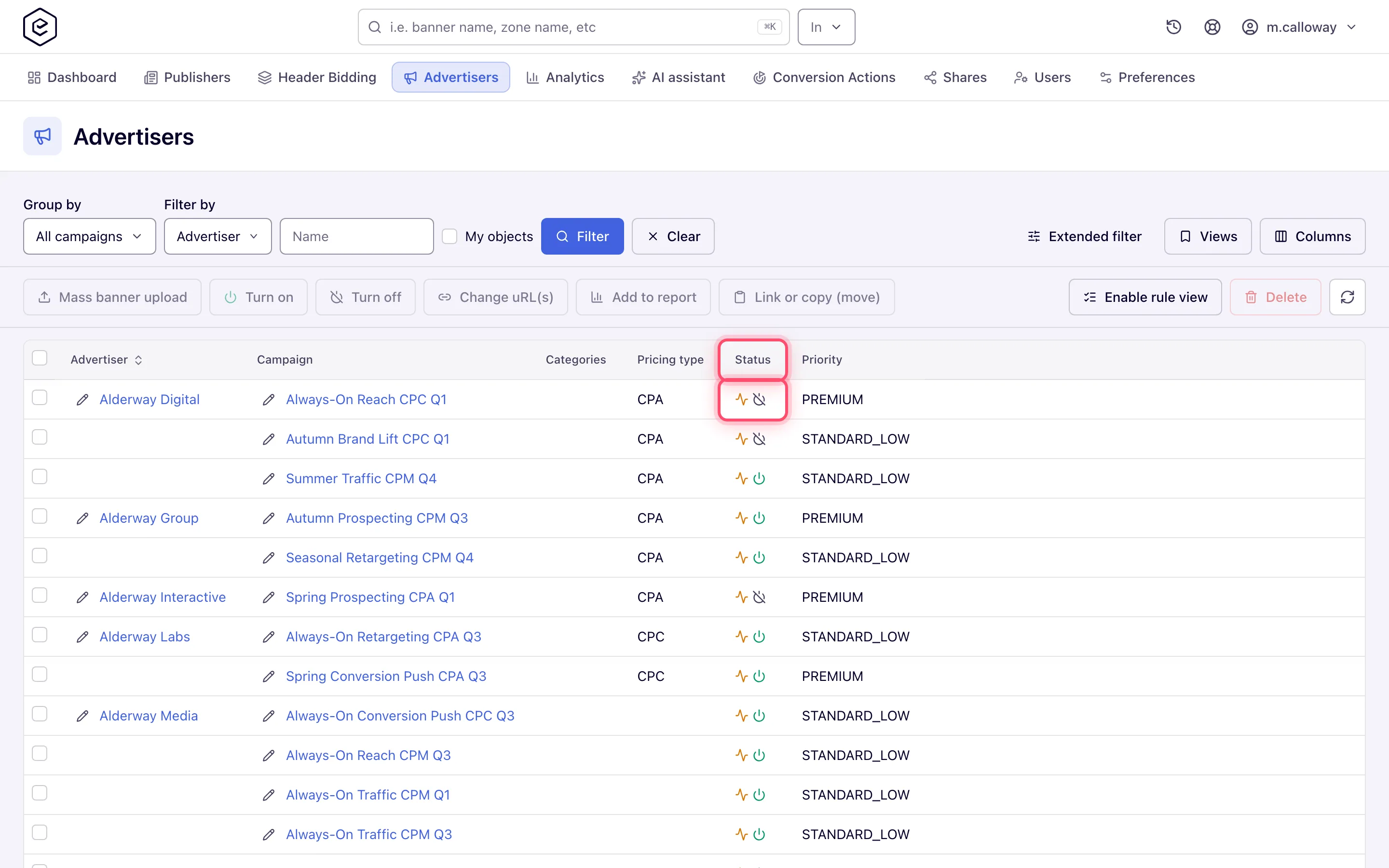
Note: the glyphs are read-only. There is no click-to-toggle inside the status column — switching an entity on or off from a grid is done with the Turn on / Turn off buttons in the toolbar after selecting rows. Those skip read-only shares; see UI navigation.
Name styling in trees and grids
| Style | Where | Meaning |
|---|---|---|
| Link colour (accent) | Everywhere a name is clickable | Normal entity you can open. This is the default in both trees and grids |
| Italic muted text | Both entity trees, and the Advertiser / Campaign / Banner grids | Masked share: the owner shares delivery but hides the identity. You cannot open or edit masked rows, and bulk actions skip them |
ID:n sub-line | Grids | Shown under the name when your ID-display preference is on |
| Faded row icon | Trees | The entity — or the placement type it derives from — is off |
Corner case: an entity with no traffic is not greyed out. The amber activity glyph is the only signal for it.
Corner case: the supply grids do not show the masked style, though the supply tree does. Sites / Zones / Placements rows know which of them are masked — they are excluded from bulk actions — but are not marked visually, so in grid mode a read-only shared site looks like any other row until an action skips it.
Serving-state pill
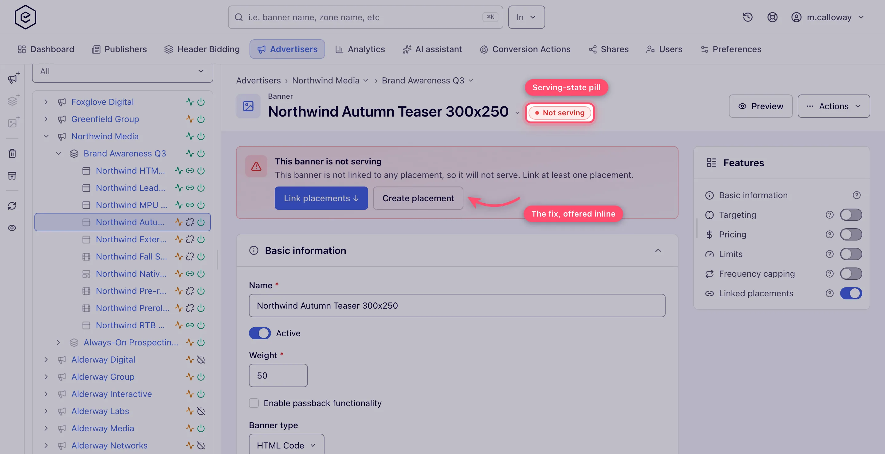
The header of every banner and placement editor carries a pill saying whether the entity can actually deliver. It is computed from three inputs: how many entities are linked on the other side, how many of those are switched on, and whether selection Rules are enabled.
| Pill | Meaning | What to do |
|---|---|---|
| 🔴 Not serving | Nothing is linked and rules are off — nothing will serve | Link at least one banner/placement, or enable Rules |
| 🟡 Rules only | Nothing is linked directly; impressions happen only where matching rules pick it | Link explicitly for a predictable setup, or review the rules |
| ⚪ Paused · N | The wiring exists but nothing serves — either this entity is off, or all N linked entities are | Resume this entity, or resume/link an active one on the other side |
| ⚪ Paused | Same, with no count: this entity is off and its only route to serving was rules | Turn the entity back on |
| 🟢 Serving · N | N linked entities on the other side are on | — |
| 🟢 Serving · A/T | A of T linked entities are on — a partly paused wiring never hides behind a plain green pill | Review the paused links if that is not intended |
Clicking the pill always scrolls to the linking card.
The setup banner
In the red, amber and grey states — never the green one — a banner appears above the cards that names the consequence and offers the fixes. Which buttons you get depends on the state:
| State | Actions offered |
|---|---|
| Not serving | Link banners / Link placements, plus Enable Rules if you may switch rules on, plus a Create placement / Create banner shortcut |
| Rules only | Link banners / Link placements and Review rules |
| Paused, because linked entities are off | Review linked banners / Review linked placements |
| Paused, because this entity is off | Go to Active switch — which jumps to Basic info, not to the linking card |
Corner case: the pill reads the entity’s saved Active state. Flipping the Active switch in the form without saving does not move the pill.
Corner case: an entity that is switched off and has no wiring at all reads Not serving, not Paused. The missing link is treated as the more fundamental problem.
Corner case: the pill counts links with its own unfiltered probe, so searching inside the linking card and matching nothing does not flip the pill to “Not serving”.
The pill renders only once the linked summary has loaded, so it never flashes a wrong state. Pausing or resuming from any surface — the tree hover card, the Active switch, a grid bulk action — refreshes the pill on an open edit page of the other side.
Setup nudge
A separate amber card with a rocket icon appears on a site, zone, advertiser or campaign that has no children yet and that you may create children for. It marks an unfinished chain, not an error, and never appears on a banner or placement.
Approval badges
Where moderation is switched on, the banner and site editors show an approval badge next to the Banner / Site eyebrow above the entity name.
Banner approval has four values and site approval three — there is no NEW for sites, and the two number the shared names differently, so never compare their raw ids.
| Status | Banner | Site | Badge shown in the editor |
|---|---|---|---|
| New | id 1 | — | No badge |
| Pending | id 2 | id 2 | Amber Pending |
| Approved | id 3 | id 1 | No badge |
| Rejected | id 4 | id 3 | Red Rejected |
Note: the absence of a badge means Approved or New — the editor deliberately badges only the two states that explain why something is not live. Use the approval queues when you need to tell those two apart.
Gating differs between the two:
- Banners — the badge needs one of
BANNERS_APPROVAL,SOFT_BANNERS_MODERATIONorBANNERS_MODERATION_WITH_DEACTIVATIONto be enabled for you. Without any of them no badge appears whatever the status. - Sites — the badge is drawn only on a site you can edit. On a read-only or masked site there is no badge regardless of the site’s approval state.
In the queues themselves the same words appear as a sortable column with a coloured pill, and the status filter offers four options on Pending banners (Pending, Rejected, Approved, New) but only three on Pending sites.
Traffic-quality levels
The Traffic Quality report scores inventory into four levels. The enum names are internal — these are the words the screen shows:
| Level | Shown as | Tone |
|---|---|---|
| GREEN | Clean | Green |
| YELLOW | Suspicious | Amber |
| RED | Fraudulent | Red |
| BLOCKED | Blocked | Grey |
The report opens filtered to Fraudulent + Blocked, the two levels worth acting on.
Warning: Blocked is a verdict, not an enforcement. Nothing in the ad-serving stack reads the traffic-quality score, so a placement marked Blocked keeps serving exactly as before. Acting on the verdict — pausing the placement, dropping the zone — is manual.
For the score bands behind each level and how to act on them, see Moderation & traffic quality.
Other signals
| Indicator | Where | Meaning |
|---|---|---|
| Notifications bell badge | Top bar | Number of notifications, tinted by the worst severity present: red for Critical, amber for Warnings, accent for Info |
| Row hover card | Entity trees | A popover beside the row: name and id, the same status glyphs, a traffic line such as “No traffic in the last 7 days” (or the last-7-days and today figures), and Open / Analytics / Pause links — Enable instead of Pause on an entity that is off, plus a Copy ad tag button on placements that have a tag |
| Not served mark | The Linked banners and Linked placements trees and grids | A video creative linked to a placement whose publisher’s video requirements it misses: it is linked but not served there. Hover it for the file’s values against the required ones. Not the same signal as the serving-state pill above. See Video creative requirements |
| Toasts | Everywhere | Green success, red error, or blue info. An info toast is what reports skipped read-only rows after a bulk action; some toasts carry an undo-style action button |
Related
- Serving state — why an entity may not serve even when green
- UI navigation, grids & trees
- Sharing & permission model — masked and read-only shares
- Ad not serving