Tour of the interface
The account shell — the tab strip and what opens each tab, trees vs. grids, the Features rail and (i) popovers, global entity search with scopes, the ⌘K command palette, recent history, notifications, and the user menu.
Ten minutes to learn where everything lives: the tab strip, the two ways of browsing your entities, the search box, the keyboard-first command palette, and the personal display settings. Nothing here changes data — click around freely.
Who this is for
Every account user. Network managers, publishers and advertisers all navigate the same shell; which tabs it holds differs by the permissions of your role — see Which tabs you get and Per-role notes below.
Prerequisites
- A working sign-in to the account area.
Steps
-
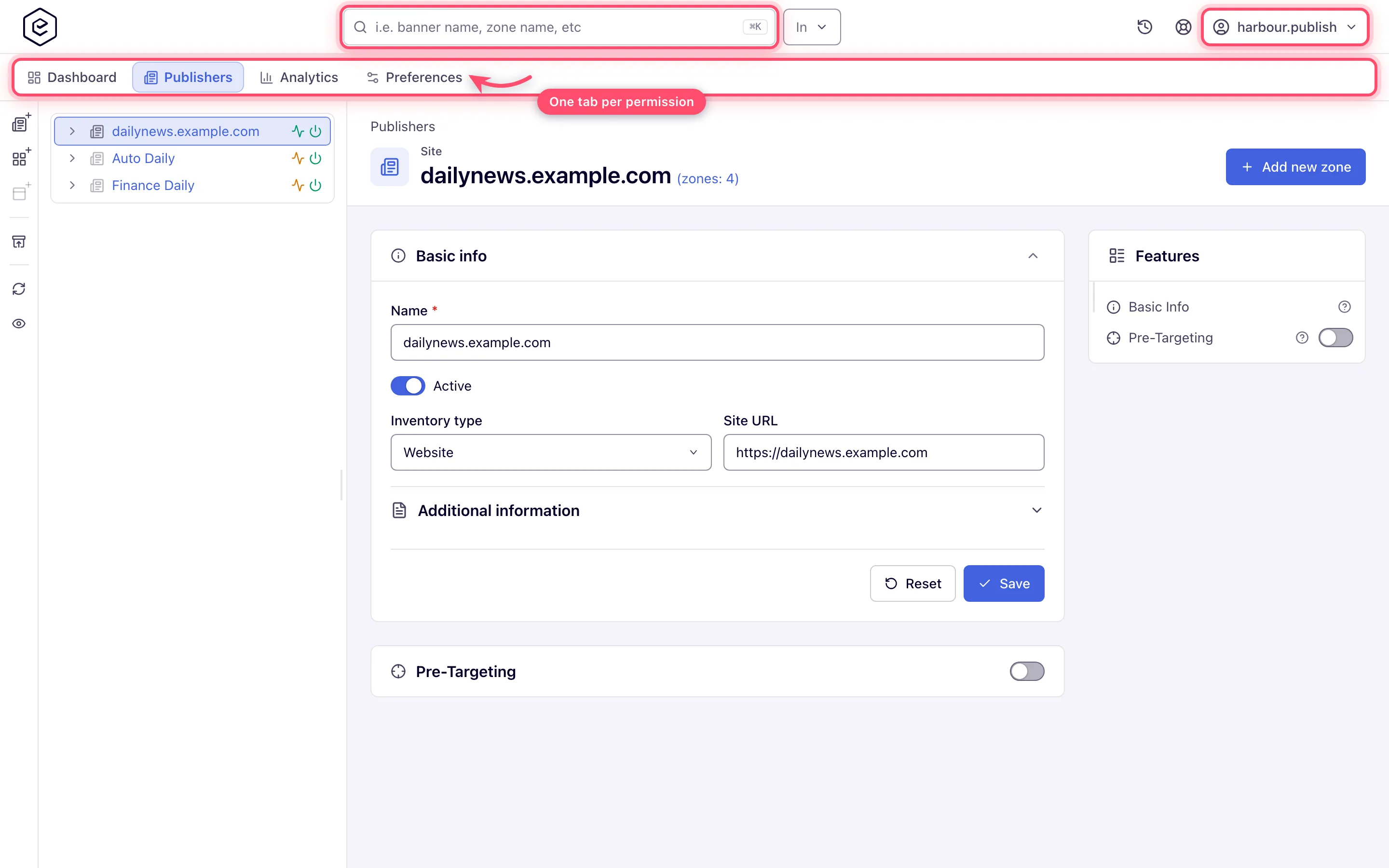
Orient on the shell. After signing in you land in the account area: a top bar with a tab strip underneath. In the top bar, the logo (it takes you back to your home section) sits at the start, the search box in the middle, and your controls at the end — Recent, the notification bell (only while you have alerts) and the user menu. Two more icons appear only when they apply: a Referral program shortcut, for roles that may use the referral program, and a Help & support link, when your network administrator has set a support page. On a phone the strip becomes a bottom bar with four tabs and a More sheet for the rest.
-
Walk the tabs. The strip can hold 18 tabs, in this order: Dashboard, Publishers, Header Bidding, Advertisers, Media Library, Analytics, AI assistant, Traffic Quality, RTB, Conversion Actions, Shares, Templates, Users, Pending sites, Pending banners, Billing, Referral program and Preferences. A role sees only the tabs whose permissions it holds — the next section lists the permission behind each. A strip wider than the window scrolls sideways behind a › button at its end. Tabs remember where you were: leave Advertisers while editing a campaign, come back, and you return to that campaign, not the section root.
-
Trees vs. grids. Publishers and Advertisers can render as a tree (the entity hierarchy with expandable levels) or as grids (flat tables per level with search, sorting, pagination, a column picker and saved views). In tree mode:
- the keyboard works the way a file tree does — Up/Down between rows, Home/End to the first and last row, Right to expand (or step into the first child), Left to collapse (or step to the parent), Enter or Space to open the entity, and typing letters to jump to the next row that starts with them;
- hovering a row opens a hover card: the entity’s name, id and serving state, a 7-day impressions sparkline with the headline figures, and quick actions — Open, a pre-filtered Analytics link, Pause / Enable, and Copy tag on placements;
- the action rail beside the tree holds the create buttons (for example New advertiser, New campaign and Add new banner for…; New site, New zone and Add new placement…), delete, reload and the hide-inactive toggle;
- dragging a campaign onto another advertiser, or a banner onto another campaign (zones and placements on the Publishers side), opens a copy/move dialog where the hierarchy allows it.
In grid mode the bulk operations — copy, move, link and unlink — go through a floating clipboard bar: tick rows and click Add to clipboard, open the destination level, select the target row, then use Paste a copy, Move, Link or Unlink on the bar; Clear empties it.
-
Entity pages: the Features rail and (i) popovers. An entity’s edit page is a stack of cards. On a window at least 1280 px wide, a Features rail at the end of the page lists the cards that exist for that entity and your role; click one to scroll to it and open it. Beside many names a small ? icon opens that feature’s page in this help center in a new tab (Read about … in the help centre); a feature with no matching page has no icon. The switch beside a card mirrors the card’s own on/off switch, and a lock marks a feature you can only view. You can drag the rail’s start edge to resize it. A new entity’s create page has no rail until it is saved. Where a field needs a long explanation, an (i) icon sits beside its label: hover it, focus it with the keyboard, or tap it to read the text; Enter or Space pins it open and Escape closes it.
-
Global search. The search box in the top bar finds entities by name — advertisers, campaigns, banners, sites, zones and placements, limited to the side or sides you may see. Press / anywhere outside a text field to jump into it. The In selector next to it is a multi-select that narrows the search to specific entity types; leave it empty to search them all. Results appear after a short pause and show the entity name and its type; inactive entities are dimmed. Enter opens the highlighted result (the first, by default); picking one jumps straight to its edit page.
-
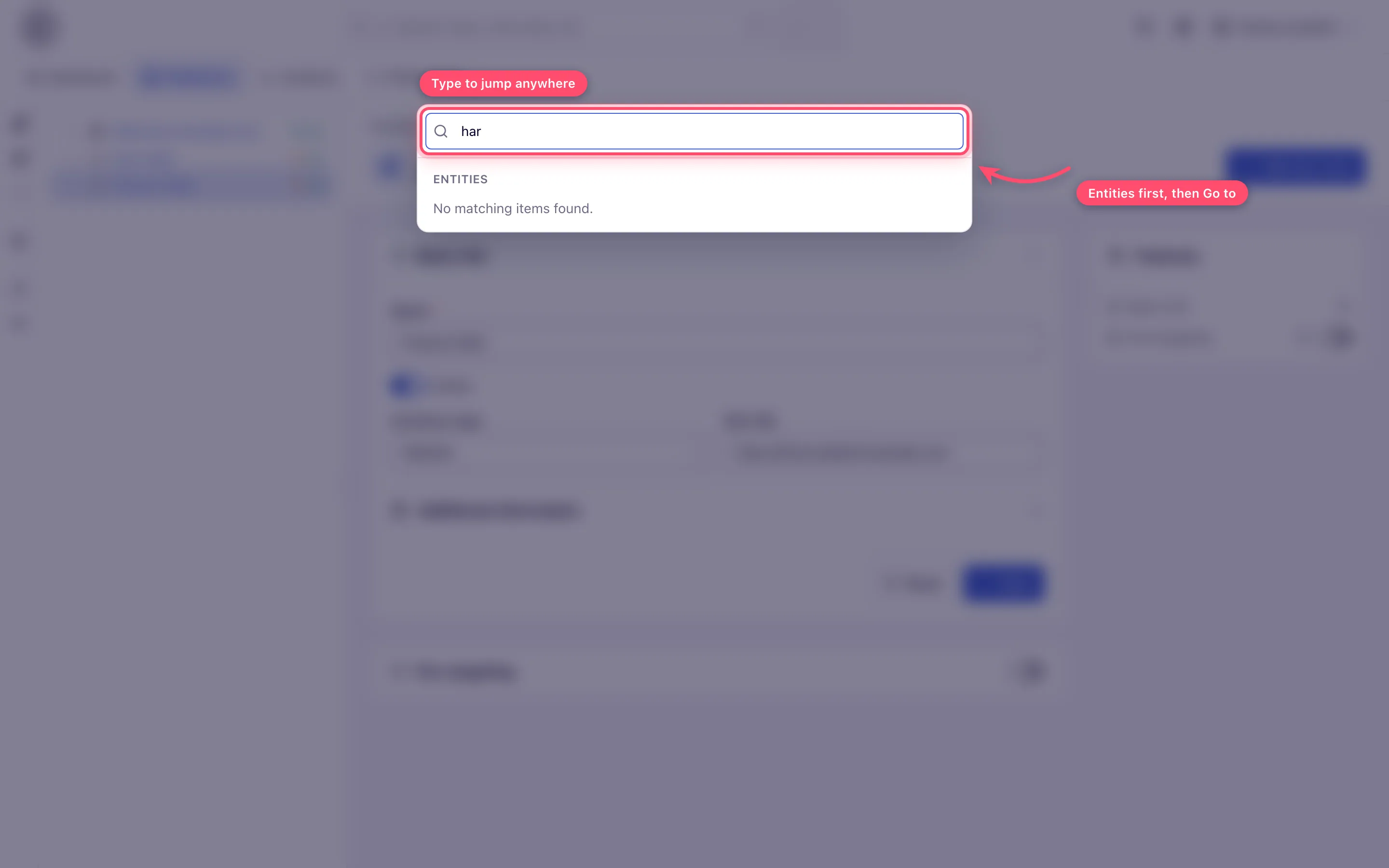
Command palette. Press ⌘K (macOS) or Ctrl-K (Windows/Linux) anywhere in the account area, or click the ⌘K chip inside the search box. One input gives you live entity results (all entity types you may see — the In scope does not apply) under Entities, and navigation commands under Go to: your tabs, filtered by what you type. Arrow keys move through the list, Enter opens, Escape closes.
-
Recent history. The Recent (history) icon in the top bar lists the last 8 entities you opened, with a short relative age (now, 5m, 3h, 2d) — the fastest way back to what you touched this morning. The history is stored in your browser, per user and per device.
-
Notifications. While you have undismissed alerts or announcements, a bell with a count (it reads 9+ past nine) appears in the top bar; its colour follows the most severe one. The popover is titled Alerts and Announcements and groups them as Critical, Warnings and Info. When more than one severity is present, filter chips (All and one per severity) appear above the list. Dismiss one with its x (hover the row), or all with Mark all as read — which, after you confirm Delete all notifications?, removes them.
-
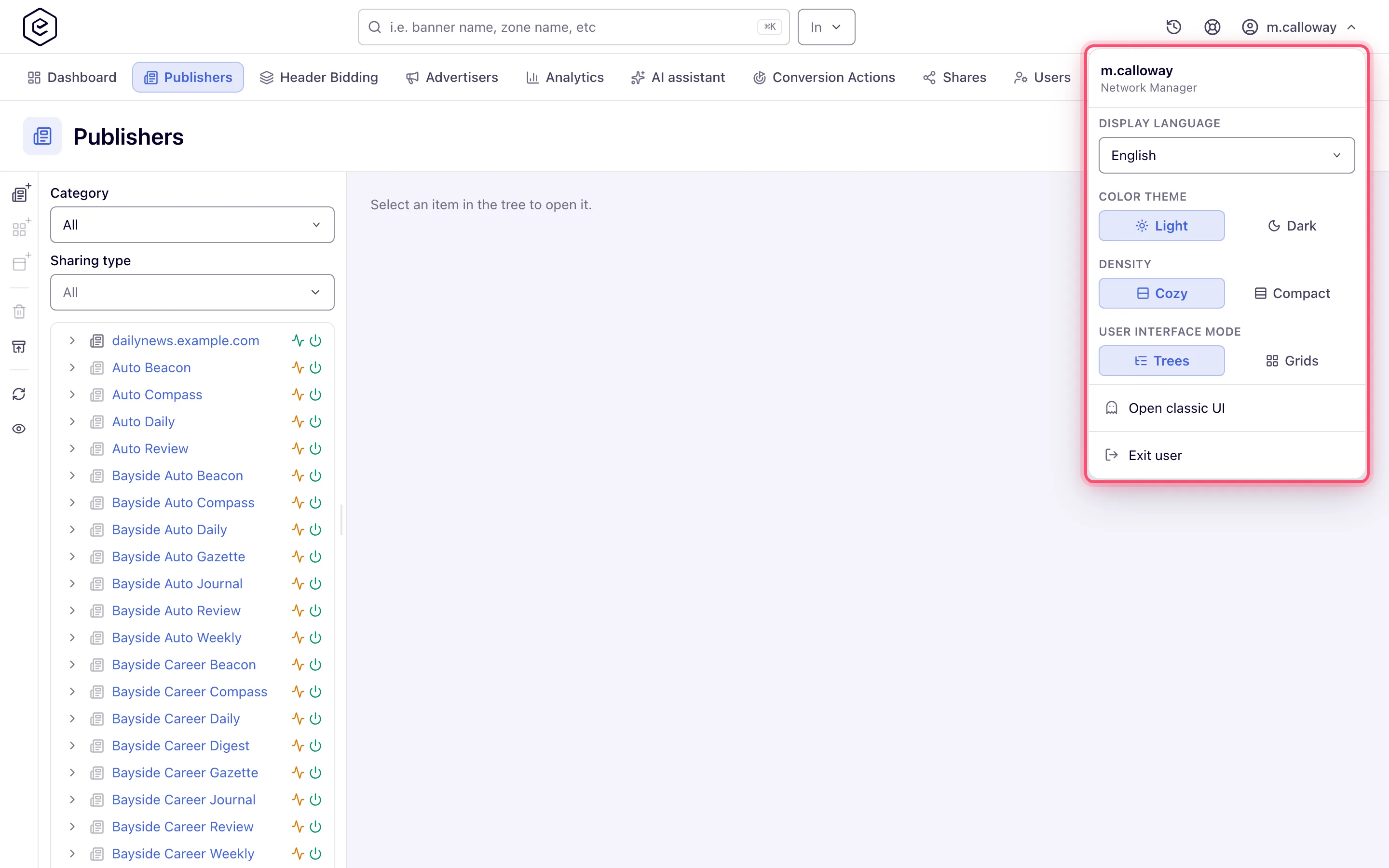
Make it yours. Open the user menu (your username, top-right). From the top it holds:
- your username and role name;
- Display language — switches the whole UI language (page reloads);
- Color theme — Light/Dark, applies instantly;
- Density — Cozy/Compact row spacing, applies instantly;
- User interface mode — Trees vs. Grids for the entity sections (page reloads);
- Open classic UI — see the next step;
- Connect AI assistant — opens the AI assistant (MCP) card in Preferences, where you connect Claude Code, Cursor or another MCP client to your account;
- Log out (or Exit user).
-
Switch back to the classic UI. If your network allows it, the user menu shows Open classic UI — it takes you to the previous-generation interface, and the choice is remembered in your browser until you use Switch to new UI in the classic header. Both UIs work on the same data, so switching loses no entity or report — but a few newer controls exist only here (see the corner case below).
Which tabs you get
Your tab strip shows only the areas your role is granted:
| Tab | What it opens |
|---|---|
| Dashboard | The widget, publisher or advertiser dashboard, depending on your report columns |
| Publishers | Sites, zones and placements |
| Header Bidding | Prebid header-bidding tags for a site’s pages |
| Advertisers | Advertisers, campaigns and banners |
| Media Library | Uploaded creatives |
| Analytics | Reports |
| Traffic Quality | Traffic-quality scores |
| RTB | DSP partners, their analytics and creative scan |
| Conversion Actions | Conversion actions and their tracking code |
| Shares | Sharing sites and advertisers with other users, in bulk |
| Templates | Creative templates |
| Users | Network user management |
| Pending sites / Pending banners | Sites and creatives waiting for review |
| Billing | Network billing |
| Referral program | The referral program |
| AI assistant | The in-product AI assistant chat |
| Preferences | Your profile, display settings, notification subscriptions and scheduled events |
A stock Publisher opens Dashboard, Publishers, Analytics and Preferences; a stock Advertiser opens Dashboard, Advertisers, Analytics, Conversion Actions, Templates and Preferences. Any other tab needs a grant from your network administrator. See Roles, permissions, and sharing.
Options and fields
| Control | Where | Notes |
|---|---|---|
| In (search scope) | top bar, next to search | Multi-select of entity types (Advertiser, Campaign, Banner, Site, Zone, Placement), limited to the sides you may see. Hidden on phones. |
| / | anywhere in the account area | Focuses the search box (not while you are typing in a field). |
| Display language | user menu | Shown only when the network enables language change. |
| Color theme / Density | user menu | Instant, saved to your profile. |
| User interface mode | user menu | Trees vs. Grids; every stock role has it; reloads the page. |
| Open classic UI | user menu | Shown only when the network allows UI version switching. |
| Connect AI assistant | user menu | Shown when MCP is on for the network and your role may use API keys, which no stock role can — ask your network manager. |
| Log out / Exit user | user menu | Exit user replaces Log out while an admin is signed in as you (run-as). |
Corner cases and gotchas
Corner case: the search box exists only in the account area, and only if you can view at least one entity side. The ⌘K palette also opens in the admin area, where it lists the admin sidebar pages you may open — there is no entity search there.
Corner case: a few controls exist only in the new interface. The data is shared, but not every control has a classic equivalent — the placement’s VAST version picker is the one that bites, because the classic page’s fixed VAST 3.0 / 4.0 rows cannot produce a viewability-measurable tag at all. Copy such tags here even if you work in the classic UI otherwise.
Corner case: “missing” menu rows are configuration, not bugs. Display language and Open classic UI are white-label switches controlled by the network; User interface mode is a role permission; Connect AI assistant needs a permission no stock role holds. Two users on the same network can legitimately see different menus.
Corner case: recents and saved grid views live in your browser, so a second machine starts with an empty history and no saved views. Theme and density follow your profile.
Corner case: in grid mode, sorting on server-paged grids reorders the whole result set, not just the visible page. A saved view captures the applied filters, the sort and the page size — not the column picker — and is kept per grid and per user, in your browser (up to 20 per grid), so a colleague won’t see your views.
Corner case: the Features rail needs a window at least 1280 px wide. On a narrower window the cards are still on the page — scroll to them.
Corner case: in a multi-select with a long option list (countries, metrics, labels), what you have already ticked is gathered into a Selected section at the top, so you can read your picks without scrolling the list. The grouping is worked out when you open the dropdown and does not move while it is open — tick a row and it stays where it is, then moves up the next time you open it. Short lists, and lists whose order is the point (months, years, days of the month), are left in their natural order.
Corner case: the dashboard is not one page. Which of the three dashboards opens is decided by the report-column permission your role holds: Basic opens the build-your-own widget dashboard, Publisher the publisher dashboard, Advertiser the advertiser dashboard (checked in that order). Without any of them the tab shows Access denied.
Per-role notes
- Network manager: your tabs are whatever your network administrator granted; ask for a missing one.
- Publisher and advertiser: see the stock tab sets in Roles, permissions, and sharing.
- Admin: the admin area has its own sidebar instead of a tab strip and no global search; ⌘K still jumps between admin pages.
- Demo account: adds a Demo ribbon, a welcome notice, a Start guided onboarding button (desktop only) and a support chat. See Demo accounts.