
Serve responsive and multi-size slots
Recipe for slots that accept more than one creative size — flexible placement size, the Any-size and Custom ad units, per-breakpoint placements, and the size-matching pitfalls that silently stop serving.
Your page is responsive: the same slot renders 728×90 on desktop, 300×250 on mobile, and maybe a 336×280 when the campaign only has that. Epom matches banners to placements by size, strictly, so multi-size serving is a deliberate configuration — this recipe covers the three strategies and the traps between them.
Who this is for
Publishers and network managers configuring inventory.
The three strategies
| Strategy | How it works | Choose when |
|---|---|---|
| Flexible placement | One placement with max dimensions + Flexible placement size; any banner that fits inside (width ≤ W and height ≤ H) is eligible | One slot, several accepted sizes, layout tolerates variation |
| Per-breakpoint placements | One placement per size; your page picks which tag to load per breakpoint | You need exact creative-slot fit and clean per-size reporting |
| Any-size placement | The Any Size ad unit accepts every banner size | Catch-all slots where dimensions truly don’t matter |
Prerequisites
- Existing site and zone (inventory setup).
- Knowledge of which creative sizes your demand actually runs — the strategy is only as good as the sizes it admits.
Steps
- Pick the strategy from the table above. Default to per-breakpoint placements when in doubt — exact matching is the most predictable.
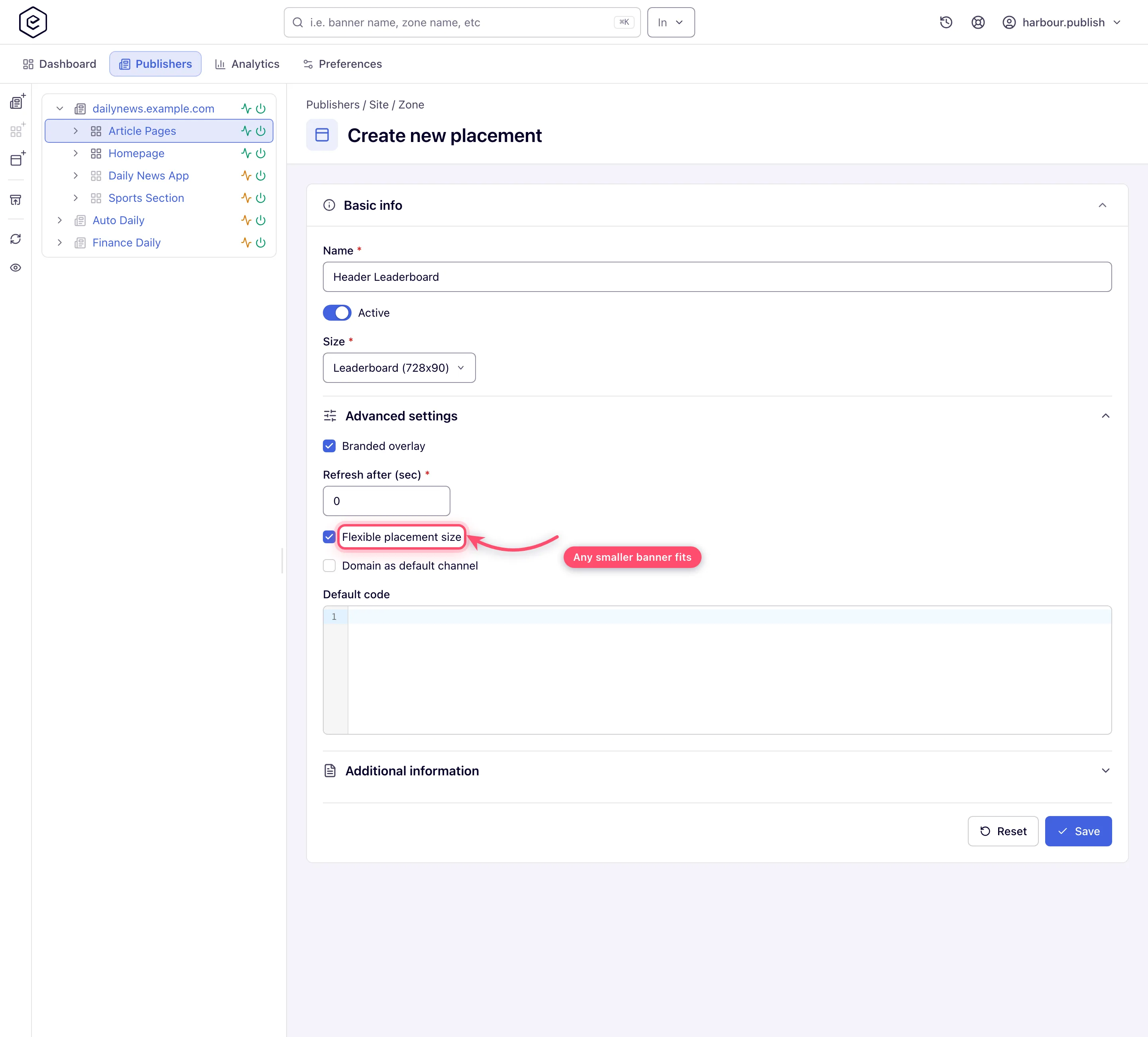
- Flexible placement: set the placement Size to the largest dimensions the slot
can show, then tick Flexible placement size under Advanced settings
(field details). Matching switches from
“equals exactly” to “fits inside”: a 300×250 banner serves into a flexible 336×280 slot,
a 728×90 does not.
- Per-breakpoint placements: create one placement per size (e.g.
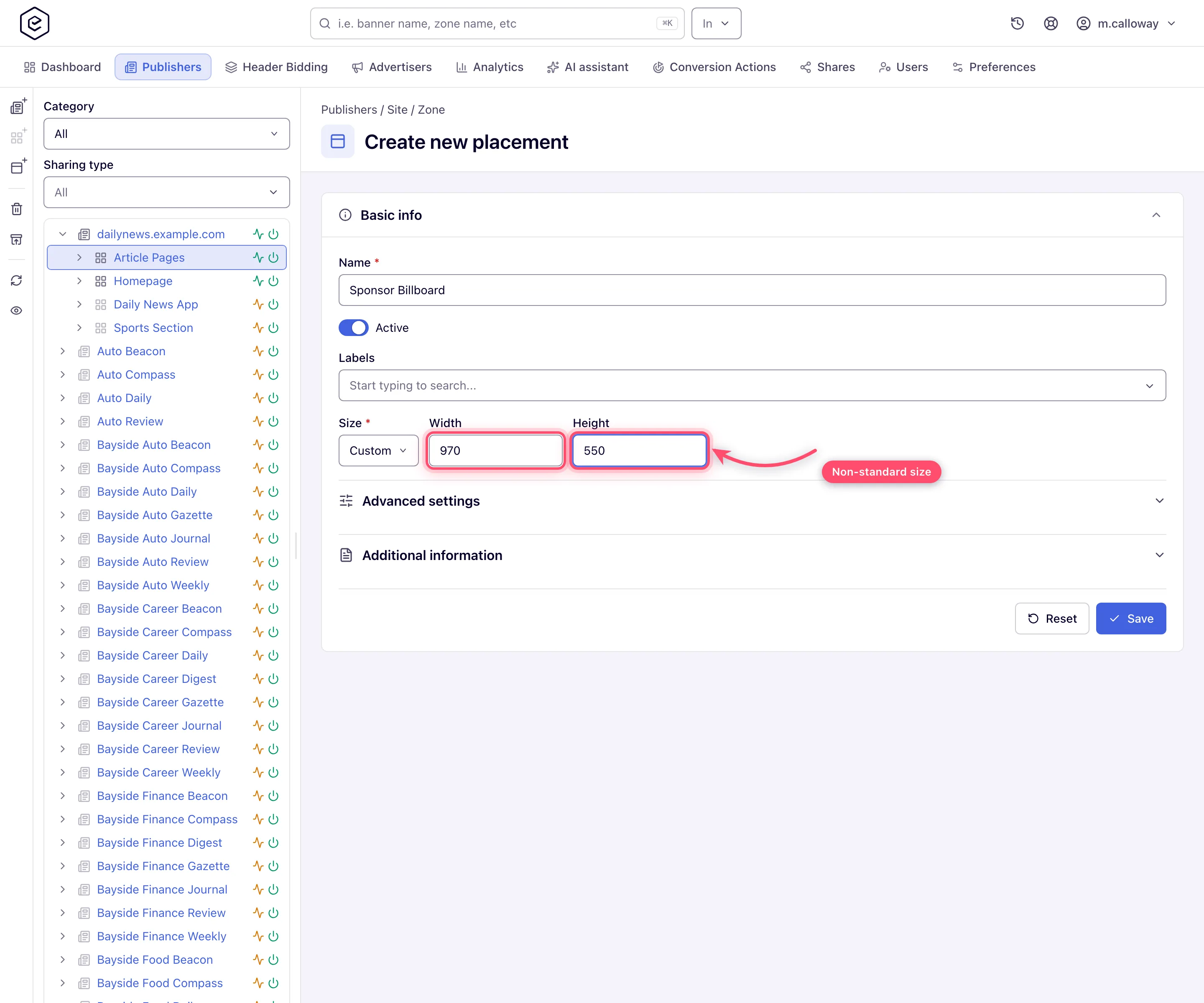
Header-728x90,Header-320x50), put each tag in your template, and let your page’s own breakpoint logic (CSS/JS) decide which tag to load. Each placement reports separately — you get per-size fill and eCPM for free. - Unusual dimensions: pick the Custom ad unit and type the exact Width and
Height (creating placements). If a
non-standard size recurs across the network, ask your network manager to have it added as a
named custom ad size (an administrator step,
other admin tools) so everyone picks it consistently.
- Keep the page layout safe. Flexible matching does not resize creatives — a smaller banner renders at its own size inside your slot. On Mobile Site and Non-standard placements, the tag’s Fit container option (the Settings tab of the Ad tags & API card) constrains rendering when the slot must stay fixed (tag options).
- Verify the match. After configuring, open the placement’s linking card — it offers only suitable banners, so if an expected creative is missing there, the size rules refused it. The full suitability table lives in Hierarchy and linking.
Corner cases and gotchas
Corner case — the silent unlink. Saving a banner re-checks all its links and silently removes placements that are no longer suitable. Change a creative from 300×250 to 336×280 and every exactly-matched 300×250 placement quietly disappears from its linking list — no warning. After any resize, re-open the linking card and re-link.
Corner case — size is compared only on some placement types. The serving side compares a banner’s size with the placement’s on Site placements (and Email). Mobile Site and Non-standard placements link a banner by placement type alone, so any banner made for that type is suitable whatever its size, and Flexible placement size changes nothing there. Plan multi-size slots on Site placements.
Corner case — flexible widens matching, not rendering. A 120×600 banner serving into a flexible 300×600 slot renders at 120×600 and leaves your slot mostly empty; a banner near the max can still overflow padding-sensitive layouts. Curate which sizes you actually link rather than assuming “fits inside” means “looks right”.
Corner case — programmatic banners that use the placement size need a concrete size. An OpenRTB DSP banner with Use placement size serves into any placement with defined dimensions but refuses placements without one — an Any-size slot gets no such demand. If programmatic matters, prefer flexible-with-dimensions over Any size (OpenRTB banners).
Corner case — a wrong fixed unit matches nothing, silently. Banners link and Rules match by size; a placement saved with the wrong ad unit simply never serves, with no error anywhere in the UI. When a new slot stays empty, size is the first thing to check — Ads are not serving.
A tag inside a hidden breakpoint container (desktop/mobile versions of the page)
Page builders often show one module on desktop and another on mobile by hiding the other with
CSS (display: none at a breakpoint). The Epom tag does not look at that:
- A hidden tag still asks for an ad and counts it. The loader never measures the slot or checks whether it is visible; it sends the request as soon as the page is ready. The ad’s markup runs inside the hidden container, so the impression is recorded although nobody can see it — the desktop tag on a phone burns impressions, and reports show both slots served.
- Hiding the
<ins>itself does not work. The loader setsdisplay: blockon the tag’s own<ins>element, which overrides a stylesheet rule aimed at that element (one without!important). Hide a wrapper around it instead. - A slot shown later can stay empty or tiny. With Fit container the ad takes 100% of its container, and a container that was zero-sized when the ad arrived renders it at zero. A breakpoint switch after load (rotating a tablet) does not request a new ad.
The fix is to put only the tag that applies on the page: render the module server-side per
device, or insert the slot from a script after a matchMedia check (with the Mount JS tag,
or an <ins> plus init() — see The JavaScript API).
Or use one responsive placement for both layouts (the strategies above), so there is nothing to
hide.
Per-role notes
- Publisher: size, Flexible placement size and the Linked banners check are yours. Fit container (Mobile Site and Non-standard placements) shapes the Universal JS tag, which the stock role holds once the network has an ad-serving domain.
- Network manager: the same. Named custom sizes (step 4) are maintained in the admin area.
- Can view share: size settings are read-only, but the linking card still shows what matches.