UI navigation, grids & trees
How to move around the platform — the account tabs and admin sidebar, trees vs grids, the grid toolbar and bulk actions, clipboard, saved views, search, command palette and keyboard shortcuts.
The account area is a strip of tabs across the top; the admin area is a collapsible sidebar down the left. They are separate navigations with separate permission systems, and no account is guaranteed to see all of either.
The account tabs
Seventeen tabs are defined. Every one of them is gated — there is no tab that everybody sees — and the strip is filtered, never reordered, so the order below is the order on screen. When the strip is wider than the window it scrolls sideways with chevrons at the edges.
| Tab | Path |
|---|---|
| Dashboard | /v2/account/dashboard |
| Publishers | /v2/account/publishers |
| Header Bidding | /v2/account/hb-tags |
| Advertisers | /v2/account/advertisers |
| Media Library | /v2/account/media-library |
| Analytics | /v2/account/analytics |
| Traffic Quality | /v2/account/traffic-quality |
| RTB | /v2/account/rtb |
| Conversion Actions | /v2/account/actions |
| Shares | /v2/account/shares |
| Templates | /v2/account/templates |
| Users | /v2/account/users |
| Pending sites | /v2/account/sites-approval |
| Pending banners | /v2/account/banners-approval |
| Billing | /v2/account/billing |
| Referral program | /v2/account/referral-program |
| Preferences | /v2/account/preferences |
The RTB tab is itself a group of three sub-tabs, each with its own permission: DSP partners, DSP partners analytics and DSP creative scan. The tab appears if you hold any one of them.
Note: a tab links back to wherever you last were in that section, not to its root — going back to Advertisers reopens the campaign list you left, not the top of the tree.
Expect to see a subset, often a small one. Each tab is gated on its own permission, so the strip is a readout of your role rather than a fixed menu: a tab whose permission your role lacks is simply absent. A network manager needs the matching permission for each tab; your network administrator grants it in Admin → Users & access → User roles & permissions. The Media Library permission ships disabled for every role, so that tab appears only after your network administrator ticks it.
Corner case: granting or revoking one of these permissions does not move the strip straight away. Permissions are cached server-side, so for a while after the change the old answer keeps being served — to the tab strip and to the pages behind it alike. If a tab you have just granted has not appeared, that is the reason; wait for the cache to reload rather than granting more permissions on top.
Corner case: administrators never see this strip. Opening an account URL with an admin session redirects to the admin area, and vice versa — the two areas are mutually exclusive per session, not two views of one place. On a phone the strip is replaced by a bottom bar: up to five visible tabs sit on it outright, and with more the first four stay and the rest fold into a More sheet.
The admin sidebar
The whole /v2/admin/** area is gated on the admin role. Inside it, the sidebar is a set of
twelve groups. Each page carries its own permission, taken from the role’s admin-UI permission
set, so you see only the pages your role has; a group whose pages are all hidden is dropped rather
than shown empty. The pages a network’s admin can be given are:
| Group | Pages | Covers |
|---|---|---|
| Users & access | 4 | User management, admin and user role/permission matrices, admin user preferences |
| Ad serving | 7 | System preferences (GDPR/TCF consent), white label, optimization, inventory & campaigns settings, auto placements, rules, additional entity fields configuration |
| Demand partners (DSP) | 3 | DSP partners, their analytics, DSP creative scan |
| Audience & analytics | 4 | DMP settings and audiences, and two pages for partner analytics data |
| Categories & labels | 4 | Advertising and inventory categories, custom country groups, labels |
| Targeting presets | 3 | Preset domain, IP-range and application-package groups |
| Creatives & tags | 3 | Custom ad units & sizes, system banner templates, VPAID frameworks |
| Notifications | 5 | E-mail, scheduled and UI notification templates, scheduled events, unsubscribe list |
| Validation & anti-fraud | 1 | Validation settings |
| Billing & fees | 2 | Ad-server fees, referral-program billing |
| Self-serve | 2 | Prototype banners, CPM floor rates |
| Audit & diagnostics | 3 | Actions log, troubleshooting log tasks, test pages |
Group labels are sentence case, and so are the page labels — Custom ad units & sizes, System banner templates, System preferences.
Corner case: a page appears only for a role (or a single user) that has its admin-UI permission ticked, in Admin → Users & access → Admin roles & permissions. Many newer pages, DSP creative scan among them, are not ticked for any role by default; ask Epom support or your account manager to add the ones you need. Two networks on the same release can show different sidebars, and a whole group is dropped when none of its pages is permitted.
Corner case: a page’s own heading is not always its sidebar label. Self-serve campaign prototype banners opens “Self-Serve prototype banners”.
For what each admin page does, see the admin guides.
Trees vs grids
Both entity workspaces — Publishers (Site → Zone → Placement) and Advertisers (Advertiser → Campaign → Banner) — render either as an expandable tree or as leveled grids.
- Your default comes from the saved User interface mode preference; the workspace toggle overrides it for the session only.
- A role may be restricted to trees only or grids only, in which case the toggle is hidden.
- Linking panels inside edit pages follow whichever mode you are currently in.
Tree mode gives an expandable hierarchy, drag-and-drop re-parenting (a zone to another site, a placement to another zone — the top level never moves), a hover card per row, and the vertical action rail on the left: the create buttons for the levels you may create, delete, reload, and a hide-inactive toggle. Above the tree sit two filters, Category and Sharing type.
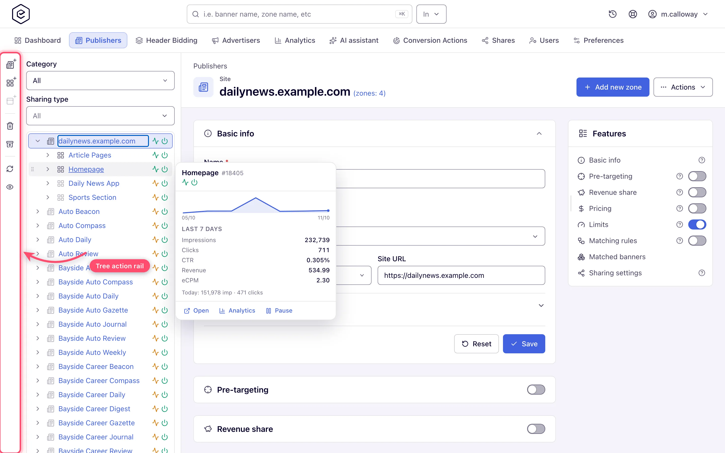
Grid mode shows one level at a time. Click a name to drill down, use the Group by level selector or the breadcrumb to come back up. Sort, pagination and page size are server-driven and the URL keeps the state, so refresh and the back button restore your view.
Tree keyboard navigation
| Key | Action |
|---|---|
| ↑ / ↓ | Previous / next visible row |
| Home / End | First / last row |
| → | Expand the node; if it is already expanded, move to its first child |
| ← | Collapse the node; if it is already collapsed or is a leaf, move to the parent row |
| Enter / Space | Open the row’s entity; on a row that is only text, expand or collapse it |
| any letter | Type-ahead — jumps to the next visible row whose name starts with what you type |
In right-to-left languages ← and → swap, so the arrow pointing into the text always descends.
Grid toolbar
The top row is the basic filter; the Extended filter, Views and Columns buttons sit at its right edge.
| Control | What it does |
|---|---|
| Group by | The level selector: switch the grid between the three levels of the workspace (Advertisers / All campaigns / All banners, or the supply equivalents) |
| Filter by | A level selector for what the Name box searches, plus the Name box itself — the grid’s own search. Press Enter or Filter to apply, Clear to reset |
| My objects | Limits rows to your own objects (the grid filters by your username) |
| Extended filter | A panel with one section per level. Sections above the current level filter the ancestors; each offers name/ID, status, traffic activity, rules on/off, labels, categories, date ranges and data-driven lookups. Filter applies, Clear resets |
| Views | Saved views — named snapshots of filters, sort and page size, per user per grid. Saving under an existing name overwrites it silently |
| Columns | Show or hide columns; the identity column cannot be hidden. Stored per user per grid |
| Enable rule view | Swaps the regular columns for rule columns: rules on/off, include/exclude rule groups, inherited parent rules |
| Refresh | Reloads the current page of rows |
Note: while the Extended filter panel is open, its own Filter / Clear replace the two in the basic row.
Bulk actions
The action buttons sit in the toolbar all the time and are greyed out until you tick at least one row — they do not appear and disappear. A level-specific button appears only on its level.
| Action | Notes |
|---|---|
| New advertiser… (or New site… on the supply side) | Top level only. Opens the create page; it needs no selection |
| Turn on / Turn off | Read-only (masked) rows are skipped; an info toast reports how many. If every selected row is read-only the action is refused outright |
| Delete | Shown only to a role that may delete. The confirmation lists the selected names. The server checks every selected entity first and refuses the whole batch, naming the one that blocks it, rather than deleting some and failing on the rest |
| Add to report | Sends the selection to the Analytics filter |
| Link or copy (move) | Puts the selection on the entity clipboard — see below |
| Labels | Adds or removes labels across the selection. Campaigns and banners levels on the demand side and the placements level on the supply side, and only with the matching label permission — there is no bulk Labels button on the advertisers level |
| Update properties | Banners level only. Mass-updates properties of the selected banners |
| Change uRL(s) | Campaigns level only. Bulk-edits the destination URLs of the selected campaigns’ banners |
| Mass banner upload | Campaigns level (and a banners list scoped to one campaign), and only with exactly one campaign selected — it stays greyed out for two or more |
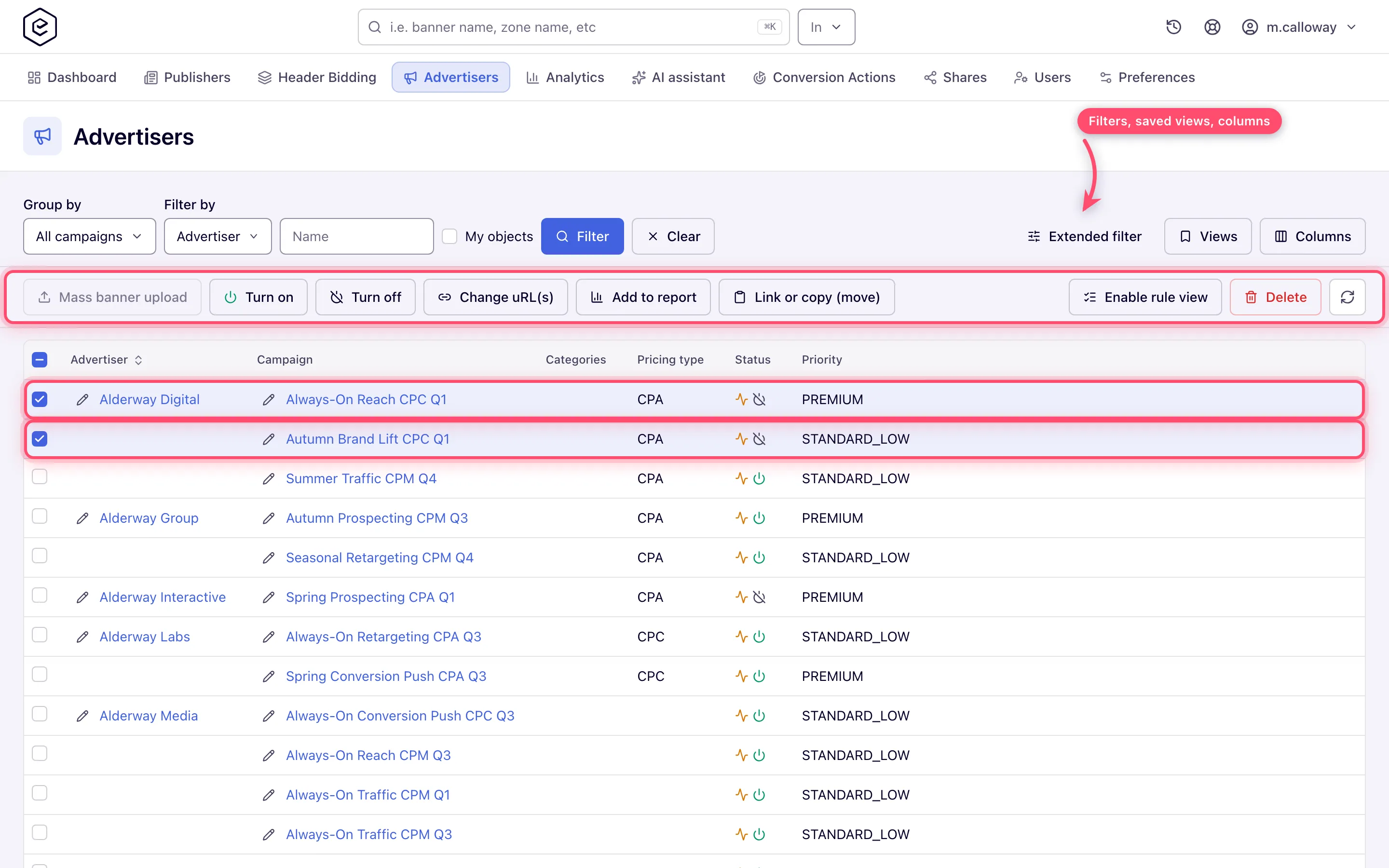
Corner case: the toolbar button really is labelled Change uRL(s) in English, with the odd capitalisation. It is a mis-cased label, not a different feature.
Clipboard (copy / move / link / unlink)
The clipboard holds one homogeneous set of entities — all banners, all campaigns, and so on — and shows as a floating bar until you press Clear. Navigate to the target grid, select target rows, then:
| Operation | Valid when |
|---|---|
| Link / Unlink | Clipboard and target are on opposite sides — banners in the clipboard, placements selected, at any levels of demand ↔ supply |
| Paste a copy | Same side, clipboard exactly one level below the target — campaigns into an advertiser, banners into a campaign |
| Move | Same rule as paste, but exactly one target row. Zones and placements move too; a moved placement keeps its placement key, so its published ad tags keep working — see Move or copy a zone or placement |
Global search, recents and the command palette
The top-bar search finds entities by name as you type; press / anywhere in the account area to focus it. The In selector narrows it to the entity types your role can view — Advertiser, Campaign and Banner with campaign view rights, Site, Zone and Placement with inventory view rights — and with nothing selected it searches everything you are allowed to see. A role with neither right has no search box. Picking a result opens that entity. Beside it, the recent entities menu lists the last 8 entities you opened.
⌘K on macOS, Ctrl+K elsewhere, opens the command palette from anywhere in the account or admin area. In the account area it shows live entity suggestions grouped by type plus the tabs your role can see; in the admin area it lists the sidebar pages your role is permitted. ↑/↓ to move, Enter to open, Escape to close.
User menu
The user menu at the top right opens on your name and role, then:
| Row | Options |
|---|---|
| Display language | Only where the network allows authorised language changes |
| Color theme | Light / Dark — applied instantly |
| Density | Cozy / Compact — applied instantly |
| User interface mode | Trees / Grids — the saved default, hidden for roles locked to one mode |
| Open classic UI | Switches to the legacy interface; only where the network allows it |
| Connect AI assistant | Opens the Preferences card that connects an AI assistant; only where the network has the assistant connection (MCP) switched on |
| Exit user | Replaces Log out while you are impersonating someone |
| Log out | Otherwise |
Admin sessions get one extra block of links, each opening in a new tab: Help center, API reference and Design system.
Corner cases
Corner case: saved views and column settings live in your browser, per user and per grid. They do not follow you to another browser or machine, and clearing site data resets them.
Corner case: in the extended filter, sections above the current grid level stay active — a campaign-level grid keeps an advertiser condition you set earlier even after you collapse the panel. Use Clear to drop everything.
Corner case: opening a deep link to an inactive site or advertiser while the tree’s hide-inactive toggle is on does not dead-end. The tree notices the entity is filtered out and offers to drop the filter so it can be revealed.
Related
- UI tour — guided first walk-through
- Statuses & indicators
- Hierarchy & linking
- Preferences — default view mode, ID display, language