
Set the theme, logos and sign-in background
Pick one of the 20 preset themes and fine-tune its colours on the Appearance tab, then upload your logos, favicon and sign-in artwork and choose the sign-in display mode on the Images tab of White label preferences — with the image rules and a fix-it checklist.
The Appearance and Images tabs of White label preferences are the look of the platform: one of 20 preset colour themes, each with a light and a dark palette you can fine-tune, and the image slots — logos, favicon, mail artwork and the sign-in background with its display mode. Both are install-wide and each tab has its own Save. They are two of the four tabs on Configure white-label branding; the company details and defaults are on Set the company details and platform defaults.
Example. Northwind Media picks a teal preset and overrides Accent for both Light and Dark,
uploads account-logo.svg, login-logo.svg, email-logo.png and favicon.ico, then puts a
full-bleed photo behind the sign-in card with login-bg.png on Cover and the scrim on. Within
five minutes its 40 publishers sign in at a page with the Northwind logo on that photo and work in
a teal interface.
Typical scenarios
| You want | Set | Where |
|---|---|---|
| A brand colour across the whole new UI, light and dark | One of the 20 presets, then Fine-tune colours → Accent | Appearance |
| Your logo in the header, on sign-in and in mail | Upload account-logo.svg (one of the pair is enough), login-logo.svg, email-logo.png, favicon.ico | Images |
| A full-screen photo behind the sign-in card | Upload login-bg.png, Display mode Cover, scrim on — then that section’s own Save | Images → Sign-in pages |
Step by step
Appearance tab — the colour theme
-
Open Appearance.
-
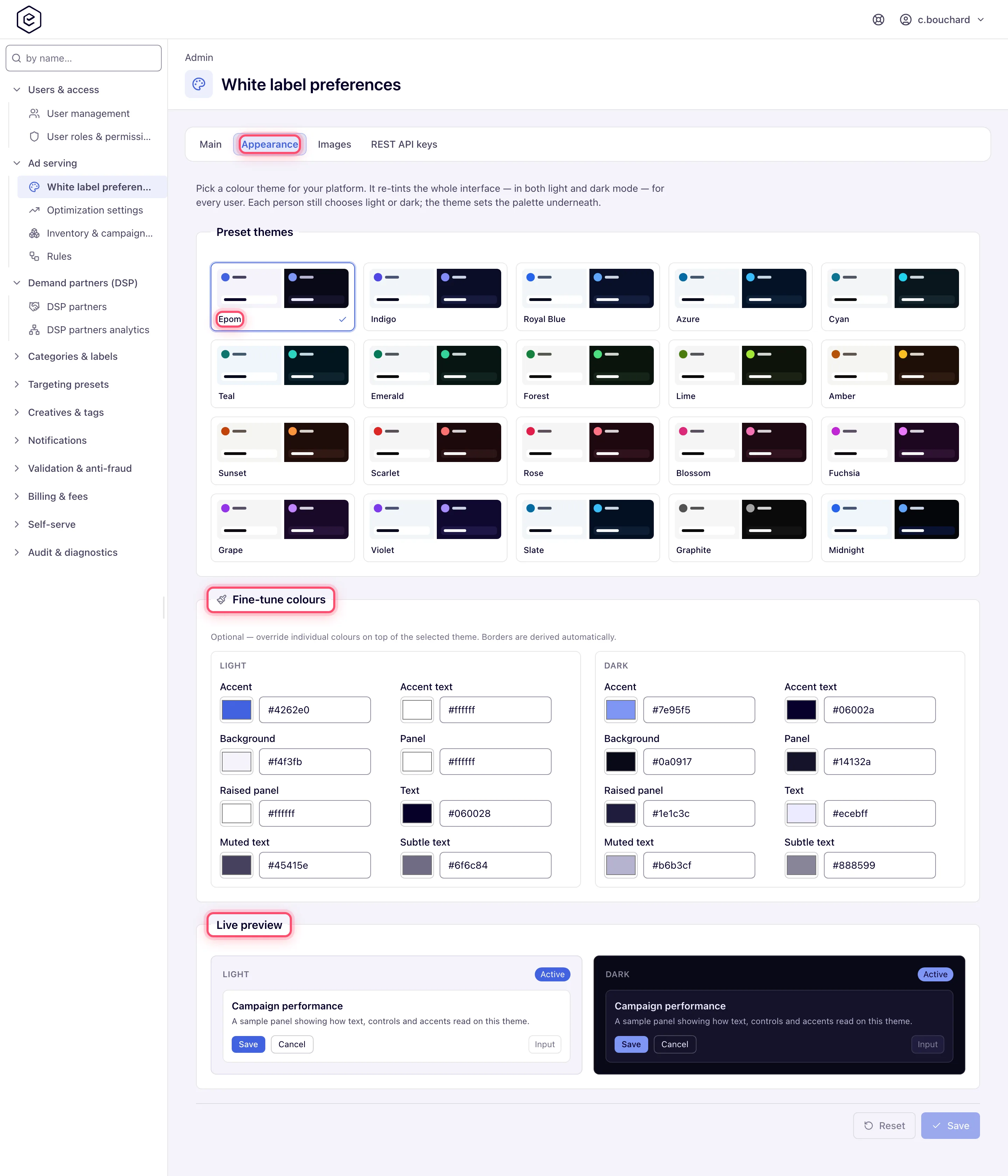
Pick one of the 20 preset themes. Each carries a light and a dark palette; the theme re-tints the whole new UI in both modes and each user still chooses light or dark for themselves. Picking a preset clears any per-colour tweaks.
-
Optionally open Fine-tune colours and override tokens — Accent, Accent text, Background, Panel, Raised panel, Text, Muted text, Subtle text — separately for Light and Dark. A Customised badge shows while any override exists; Reset to preset clears them. Border colours are derived and not editable.
-
Read both Live preview cards; they render in their own palette whatever mode you are in.
-
Click Save. The toast reads Theme saved — it now applies across the platform and your own session repaints without a reload. Save and Reset stay disabled until you change something.
Images tab — logos, favicon and the sign-in background
-
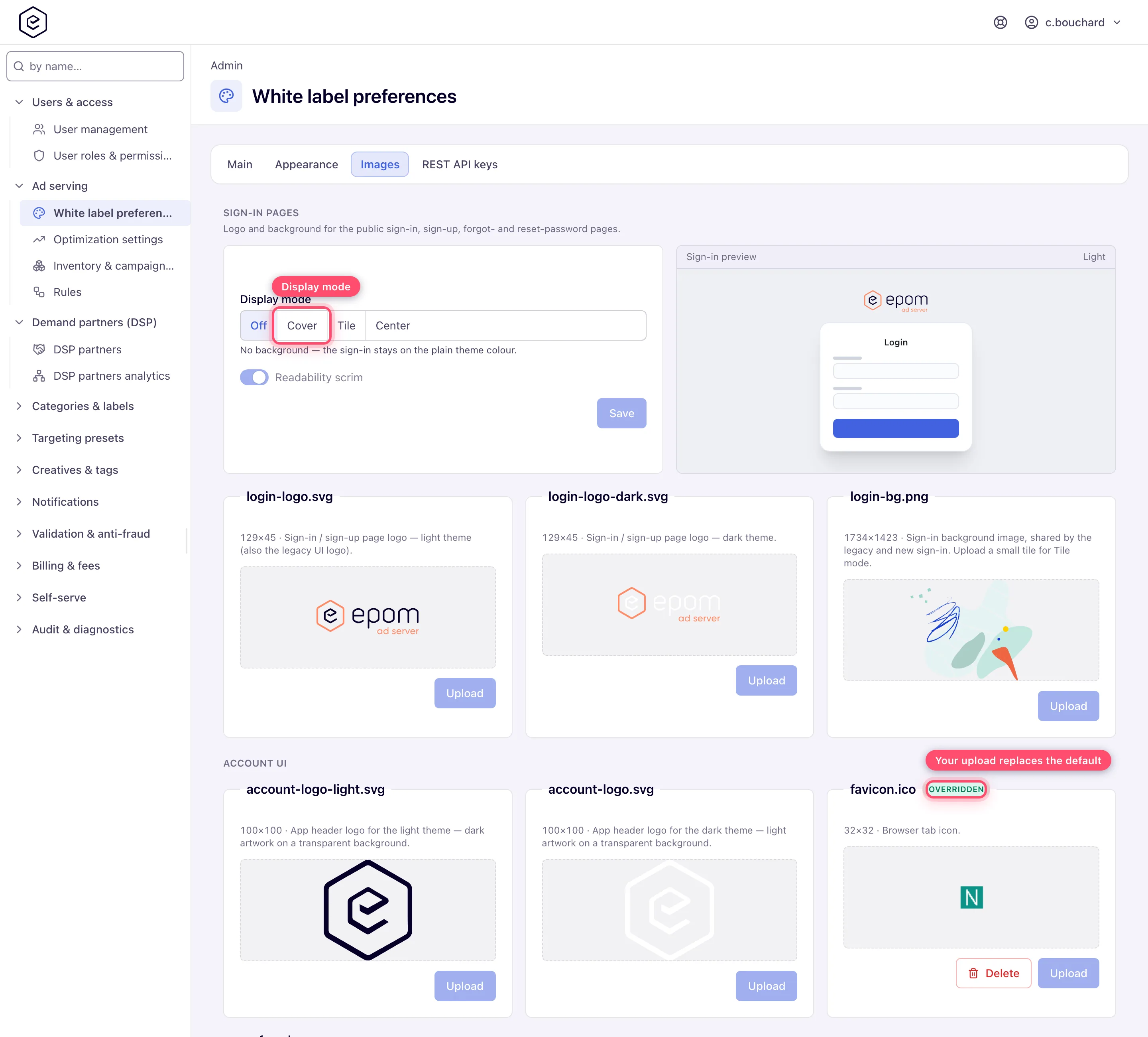
Open Images. It starts with Sign-in pages (the public auth branding with a live preview), then the slots grouped as Account UI, Emails, Email reports and Ad serving.
-
In Sign-in pages, choose a Display mode — Off, Cover, Tile or Center — and turn Readability scrim on or off; the Sign-in preview updates as you click. This block has its own Save button.
-
To replace an image, click its preview (or drop a file onto it). The card previews the file locally and Upload becomes available. Click Upload; a Done toast confirms it.
-
A green Overridden badge marks every slot running your file; only those get Delete, which asks Revert to default image? and brings the stock artwork back.
Caveats and exceptions
The theme re-tints only the new UI. The classic interface, notification e-mails and served-ad markup keep their own colours. On a repeat visit the new UI paints from a browser cached copy and refreshes from the server, so the first load after a theme change can show the old palette for a moment.
Image rules. Each slot accepts only the type its extension implies (SVG, PNG, or ICO/PNG
for favicon.ico). A raster file must match the slot’s default dimensions exactly; an SVG only
has to declare a width of 500 px or less; a favicon must be square and at most 500 px;
login-bg.png accepts any size. A rejected file produces a toast naming the rule and nothing is
stored. The SVG message quotes a number to ignore (Size must be 100x100, or up to 500px wide):
only the 500 px cap applies. The two logo pairs fall back to each other, so one of each pair is
enough; no other slot has a fallback. Files are stored and served byte for byte, so upload only
artwork you trust — particularly SVG, which is markup rather than pixels.
The classic sign-in ignores the display mode. It always paints login-bg.png in its fixed
867×711 centred rendering and never applies the scrim; Off removes the background from the new
sign-in only.
The caveats that apply to every tab — who can do this, the Main-tab save that switches the sign-in background off, how long changes and images take to reach every server and browser — are on Configure white-label branding.
Not working?
| Symptom | Check | Where |
|---|---|---|
| A new logo or favicon does not show | Browser cache (favicons up to 5 minutes), server propagation (1 minute) | Wait, reload in a private window; check the Overridden badge on the slot |
| Upload refused with a size message | Raster must match the slot’s size exactly; SVG width ≤ 500 px; favicon square ≤ 500 px | The size printed on the card; the SVG “100x100” figure can be ignored |
| The theme did not change | You are on the classic UI, or the first paint came from the browser cache | Switch to the new UI; reload once |
The causes for the other tabs are on Configure white-label branding.
Reference
The presets and tokens: Appearance tab; the four display modes: Sign-in background modes; the 11 slots with their sizes: Image slots.
