
Tour of the interface: trees, grids and entity pages
Stage 2 of the interface tour — browsing Publishers and Advertisers as a tree or as grids, the keyboard in the tree, the hover card, drag-to-copy, the clipboard bar, and the Features rail and (i) popovers on an entity page.
Goal: read an entity’s last 7 days without opening it, and find the one card you need on a long edit page — the two ways of browsing your entities and what an entity page offers. This is one stage of the Tour of the interface; the tour needs no data and changes nothing.
Steps
-
Trees vs. grids. Publishers and Advertisers can render as a tree (the entity hierarchy with expandable levels) or as grids (flat tables per level with search, sorting, pagination, a column picker and saved views). In tree mode:
- the keyboard works the way a file tree does — Up/Down between rows, Home/End to the first and last row, Right to expand (or step into the first child), Left to collapse (or step to the parent), Enter or Space to open the entity, and typing letters to jump to the next row that starts with them;
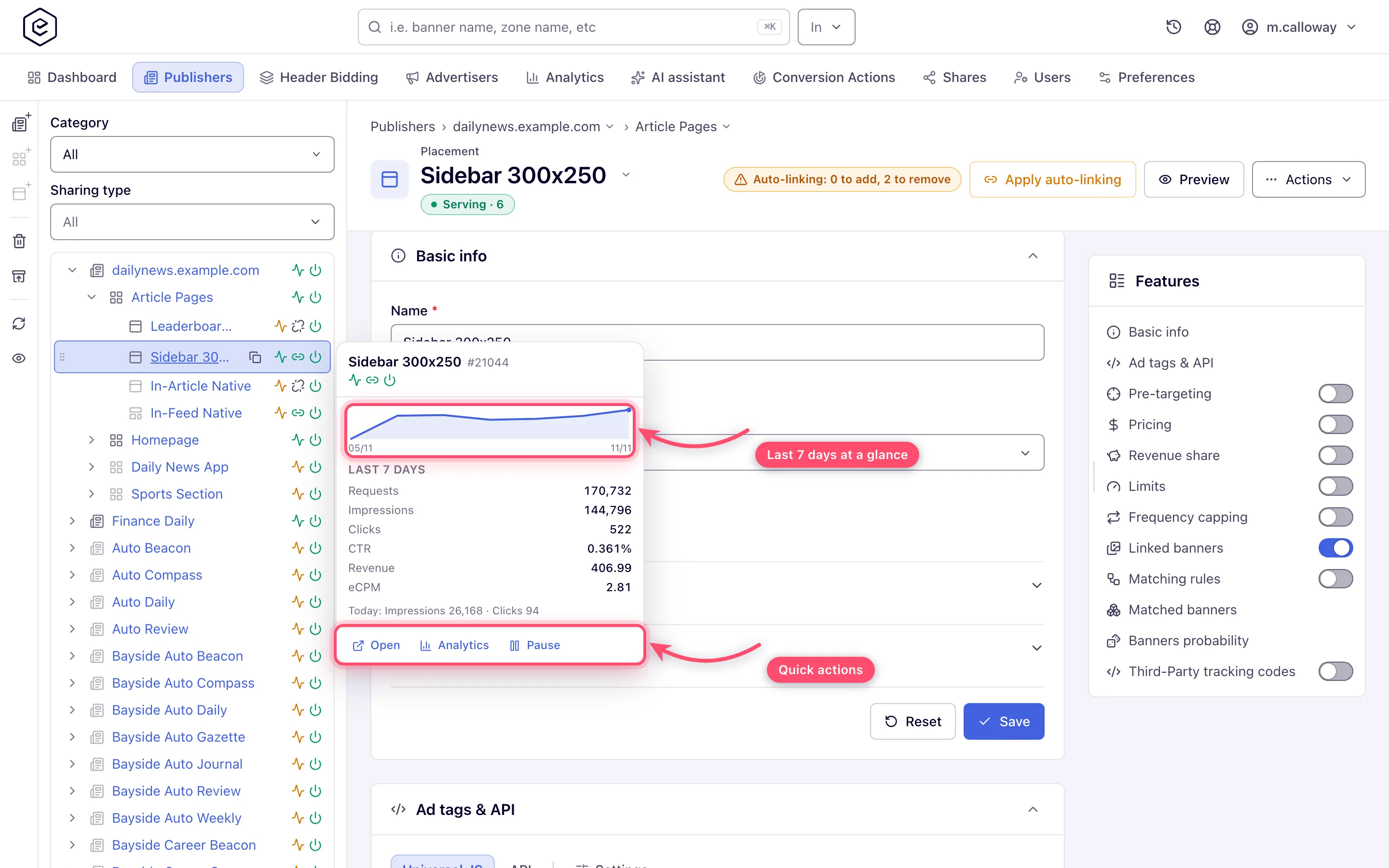
- hovering a row opens a hover card: the entity’s name, id and serving state, a 7-day sparkline with the figures your role reads in its reports (Viewable impressions, Viewable CTR and vCPM on a role on viewable impressions), and quick actions — Open, a pre-filtered Analytics link, Pause / Enable, and Copy tag on placements;
- the action rail beside the tree holds the create buttons (for example New advertiser, New campaign and Add new banner for…; New site, New zone and Add new placement…), delete, reload and the hide-inactive toggle;
- dragging a campaign onto another advertiser, or a banner onto another campaign (zones and placements on the Publishers side), opens a copy/move dialog where the hierarchy allows it.
In grid mode the bulk operations — copy, move, link and unlink — go through a floating clipboard bar: tick rows and click Add to clipboard, open the destination level, select the target row, then use Paste a copy, Move, Link or Unlink on the bar; Clear empties it.
-
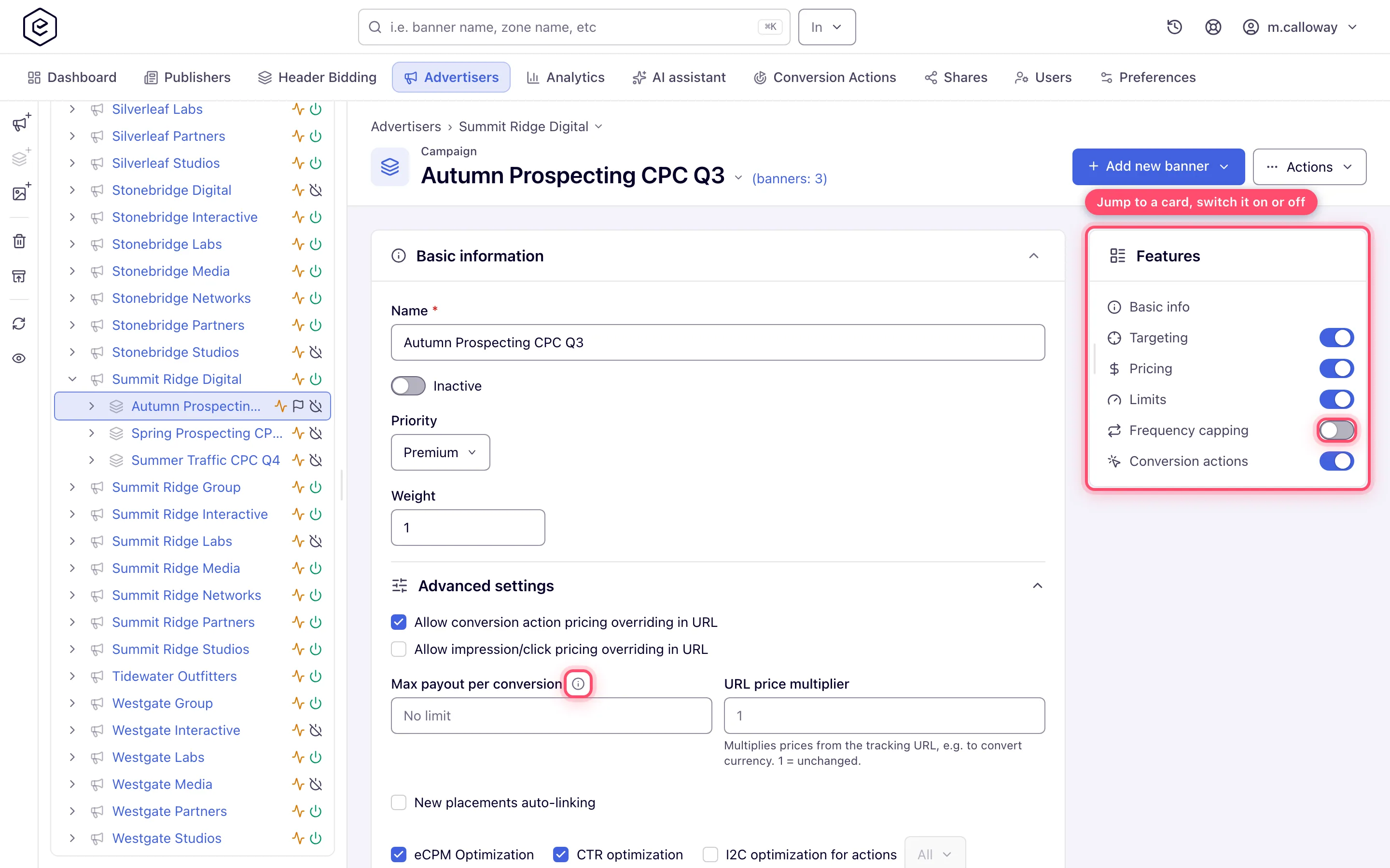
Entity pages: the Features rail and (i) popovers. An entity’s edit page is a stack of cards. On a window at least 1280 px wide, a Features rail at the end of the page lists the cards that exist for that entity and your role; click one to scroll to it and open it. The switch beside a card mirrors the card’s own on/off switch, and a lock marks a feature you can only view. While the rail is showing, a card whose feature is switched off leaves the page — its rail switch turns it back on, and clicking its name brings the card back, collapsed, until you switch it on. You can drag the rail’s start edge to resize it. A new entity’s create page has no rail until it is saved. Where a field needs a long explanation, an (i) icon sits beside its label: hover it, focus it with the keyboard, or tap it to read the text; Enter or Space pins it open and Escape closes it.
What next
- Tour of the interface: search, the command palette and recents — the next stage
- Tour of the interface — the whole tour and the gotchas
- Statuses and indicators — what the badges and pills mean
